Notifications
Logout
Are you sure want to logout?
Yes
No
Notifications


Full Name
Enter full name
Contact Number
Enter contact number
Enter valid contact number
Email Address
Enter email address
Enter valid email address

7 Dec 2021

7 Dec 2021
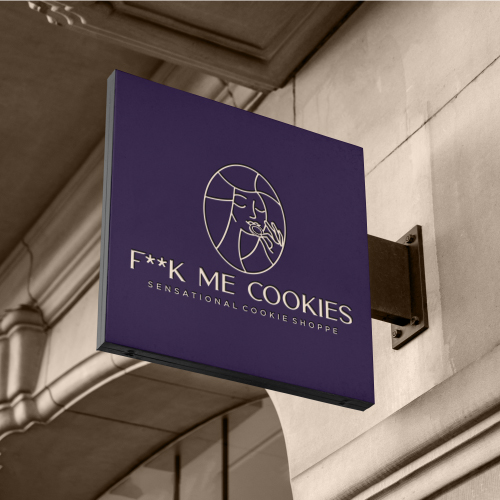
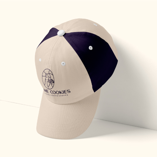
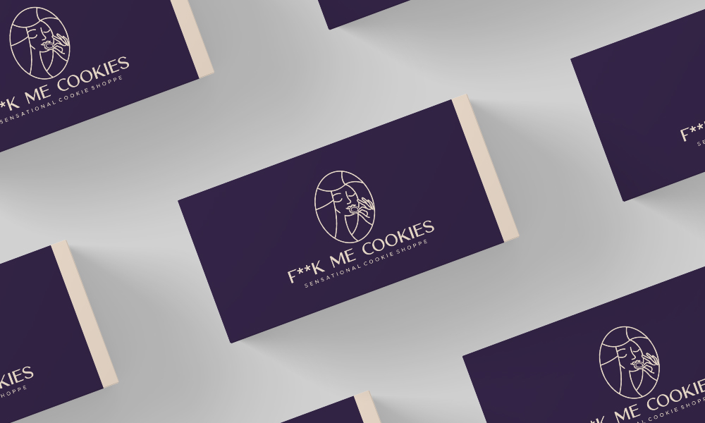
The given design is the type of Iconic Logo. It represents a girl designed inside the round shape. The girl is shown eating the cookies, adding some taste to it. It shows the taste delivering nature of the cookies that provides satisfaction to its customers.
Cookies are liked by almost all ages of people and are consumed throughout the world for their nutritional value. Cookies are available in a wide range of shapes, colors, and tastes and are hence accepted by consumers of all age groups. These can be stored for longer durations. Cookies are the perfect snack if we have a lot of activity in the morning. Cookies are the ever-tasty and lip-smacking food item ruling the world without a stop. Most of us eat cookies for taste and they never fail to satisfy our sweet hunger. F**K Me Cookies logo is designed in a way that would never dissatisfy its customers.

The F**K Me Cookies is a stylized Iconic Logo in the lineart form to give a graceful appearance that symbolizes the engagement of customers. It consists of a girl eating the cookies with full excitement. It shows that the taste of the cookies provides delight to the customers. The Logo can be considered as the soul of its brand, industry, and company, which would satisfy the craving of the customers.
The given type is the type of Iconic Logo. As simplicity reveals beauty so it should be straightforward, as the sharp outline of the given design. This showcases the efforts of an organization in a beautiful and tasty way. The great attribute and advantage are that it is easy to remember even after a long period. The logo is represented clearly to communicate with the consumers or audience.
It represents a girl designed inside the round shape. The girl is shown eating the cookies, adding some taste to logos. It represents the leadership qualities of the industry and plays a vital role in emphasizing the design of the brand to the audience. It also helps to distinguish the business of an organization from the other.
It shows complexity with different functions that could be remembered even after a long time, and more than it is a long-time memorable logo that will enable its glimpse in the minds of people for a very long time making it shortlisted in the list of memorable logos.
It is simple and highlights uniqueness in every perspective. Its appealing formation helps to stabilize it on the path of professionalism without affecting its uniqueness.

All of us heard about the terms related to the logo that indicates icon, mark, brand, and emblem. These terms are probably used by people who are into the business of Graphics.
An Icon Logo goes is associated with the attribute that promotes brand recognition in the market. It helps to empower the industry to differentiate their products services from the other creatives with greater effects.
Iconic logo design is considered as a symbol that conveys strong, universal values and ideas that make it recognized in a convenient way. It shows straightforward nature and bold representation of a company.
An icon can be in the shape of a recognizable item, it is typically changed in an abstract way to make it stand out in an appealing way. The design highlights the joy, enthusiasm, and creativity, of the industry that brings success, encouragement, taste, and change.
It also represents the high determination of the industry that brings happiness, fun, enjoyment, and balance for its customers.
Hex colors are based on the RGB color model that has been in use since the early days of photography. The theory behind the model is that you can create virtually any color the eye can see by assigning different combinations of red, green, and blue color values. On the web and most digital applications. The RGB color model is used by televisions, digital cameras, and video projectors in addition to practically every computer and phone screen in existence. A shade is achieved by adding black to any pure hue, while a tint is created by mixing white with any pure color.
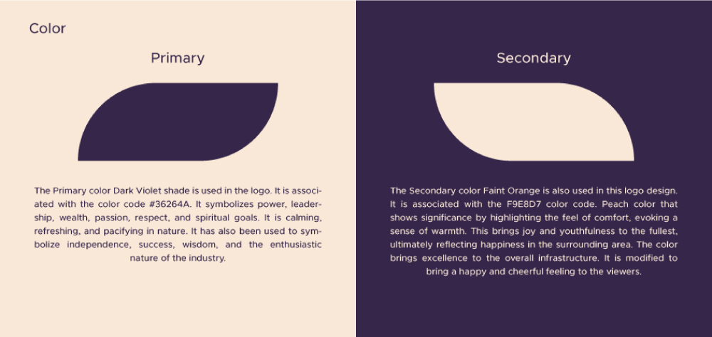
The Primary color Dark Violet shade is used in the logo. It is associated with the color code 36264A. It symbolizes power, leadership, wealth, passion, respect, and spiritual goals. It is calming, refreshing, and pacifying in nature. It has also been used to symbolize independence, success, wisdom, and the enthusiastic nature of the industry.
The Secondary color Faint Orange is also used in this design. It is associated with the F9E8D7 color code. Peach color that shows significance by highlighting the feel of comfort, evoking a sense of warmth. This brings joy and youthfulness to the fullest, ultimately reflecting happiness in the surrounding area. The color brings excellence to the overall infrastructure. It is modified to bring a happy and cheerful feeling to the viewers.
The colors are selected based on their tastes and preferences. Most of the designers would do best to refer to the basics of color theory. One of the simplest aspects of the given concept is the use of the proper color combination. This shows the artistic creation of a designer who created a color combination that avoids straining the eyes of viewers.
Font plays a crucial role in delivering the right message to the target audience. It forms the foundation of a logo design that shows an ability to depict the values of the company in a positive manner.
The font plays an important role in denoting the tone of the text in an effective manner. Consider it to be a form of visual language. In addition to the different types of font used for particular purposes, the font in a logo design adds up the essence of a brand. Each typeface can communicate a different meaning with a different perspective. These can highlight the emotions of the industry as well.
Large, bold fonts depict a loud, alarming tone that demands attention while tiny fonts which channel subtlety sound more demure and polite. The tone of the font is of utmost importance as it provides a distinctive perspective to your brand. Therefore, the typeface should always be inclined with the tone of the message the industry wants to convey through the fonts of the logo.
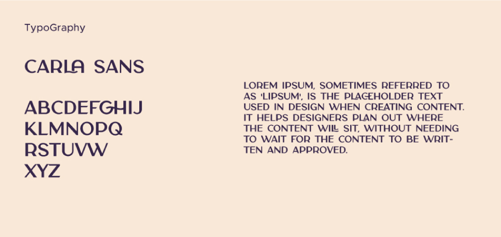
The font used represents the Carla Sans which is considered a very versatile font that works great in large and small sizes as well. It shows its perfectness when used in branding projects, Logo design, magazine headers, or simply as a stylish text overlay to any background image, as these are most pleasing to the eyes. These are used to signify superiority in a modern way.
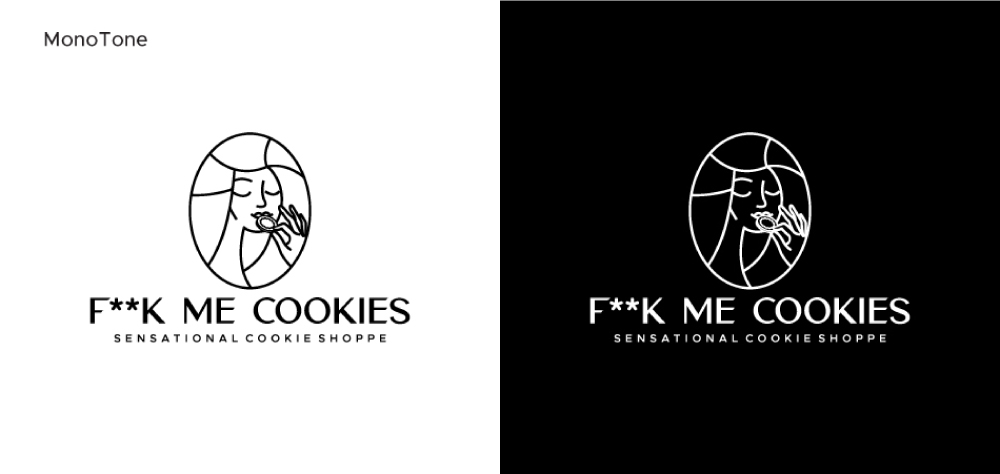
Monotone indicates using of only one color. This is particularly used to mean black and white. Removing color means that the images rely fully on tone to describe light, shape, and form. Like many photographers choose to work with black and white images.
Monotone when used in a proper way while designing, monotone colors deliver a result that is smooth, elegant, and comfortable to the eyes.
When a logo designer wishes to grab the attention through graphic design, then it becomes mandatory to understand how to use the color schemes or monotone. With monotone colors, the colors the designer use usually depend on the product you are designing.
Submit Design
Height and Width should be the same (e.g. 1000 x 1000)
Supported file formats : .JPG / .JEPG / .PNG

Submitting...
Submit Design