Notifications
Logout
Are you sure want to logout?
Yes
No
Notifications


Full Name
Enter full name
Contact Number
Enter contact number
Enter valid contact number
Email Address
Enter email address
Enter valid email address

16 Dec 2021
16 Dec 2021
A Logo is a design or image that is used to symbolize the business of an organization. It is also used to identify the products, uniforms or vehicles, etc. Any company, organization, or brand keeps it at the apex of all the other things. It is the first point of sharing the thoughts of any brand with its target audience. It acts as the soul of any brand. A brand is nothing without it. We have learned the types and uses of logos in the previous blogs. Let us move forward and look at the key factors to be considered in designing a Lettermarks (Monogram) Logo.
These are nothing but the full forms of abbreviations. Abbreviations are those that are loved by a large number of people. Though it is OMG! (Oh My God) or LOL (Lots of Loud). Most people have a habit of making abbreviations like GST (Good Night, Sweet Dreams and Take Care) which sounds somewhat ridiculous.
Lettermarks or Monograms could turn the business of an organization into an identifiable brand identity. These could work as the best option while starting a new or small business to get the name out there. As these are associated with personality, prosperity, and financial power; hence works as the best option for the brands that are trying to highlight themselves to the maximum number of consumers. For example, HP and LG.
In Greek cities, monograms were used for the royal signature, which marks its presence on the ancient coins. These were also used as Christian symbols, and the Greek cities used to issue the monogram coins with the use of the first two letters of the city name.
The Chi-Rho lettermarks were used as a military standard. These were also used by the craftsmen and artists for signing their artwork in the middle ages.
These created a status in the society, which made the good identity of the Monogram. They made their unique identity and started a practical mode of identification. It gradually marked its importance in society as one of the best logo designs.
Monograms belong to the class of Name-Based Logos and could be considered as the brother of Wordmark Logo. So it has few similarities like its brother. As the Wordmark usually consists of text i.e. the company names and the initials or something of the same kind. These are the names of the companies that are set in some particular type of font.
Similarly, the typeface is also considered an integral part of Lettermarks. It helps to showcase what the brand is all about, and also highlights innovation, creativity, and professionalism. It expresses the right message directly to the target audience. These are present in the abbreviation form to help the customers think about the full form and the brand message as well. This is a good strategy if the logo letters are arranged well in a proper direction.
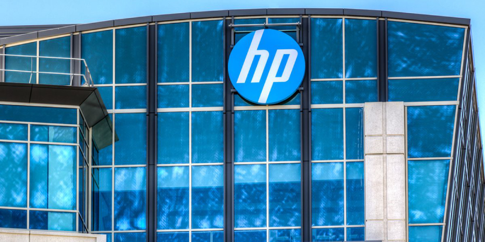
The original logo of HP was created in a monochrome color palette. It depicted a unique italicized lowercase with white color, that was set on a solid black circle.
Later on, the Blue colored background changed to White and the Circle too changed its colors to Blue, which hide its tails and made the abbreviation filled with White color.
HP is in the form of abbreviations that marks the name of the Company, Hewlett Packard. It creates the status and identity of the brand and highlights the great vision of the industry. It has built up trust in the market, which cannot be affected by anyone.
The letters on the logo remained untouched in 2012, and it came up with the new colored background, and started looking fine. It is pretty simple and unique with just two letters of the name of the company written in an elegant style.
As all human faces are unique and contribute to individual identity. Moreover, the face is one of the most fundamental parts of the body for self-recognition. Along with this, there is a requirement for proper set-up or layout to give an elegant outlook. As with the face, a proper layout is required by the lettermarks as well, to give it an elegant look.
The layouts give the monograms a fine identity and bring modification to their look. It creates a long-lasting effect on the mind of people. These are crucial to creating their personality, along with highlighting the significance of the brand.
It masters the content used to describe the brand names, logo concepts, and many more, and also helps to build the status and body language which makes the first impression.
The layout with the Lettermarks helps to convey the brand idea in a better way to the customers. It proves to show the best connectivity that makes the audience feel personally involved in the brand mission. When the letters are interlocked with each other to make an appealing design, then the use of layout with the typeface marks its uniqueness.
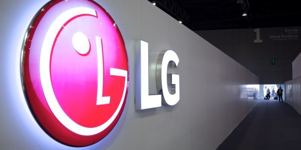
The abbreviation LG depicts Lucky-GoldStar, which found the new era of the company in 1995.
The industry modified it in 2008, which brought a three-dimensional look to it and elevating the color of the lettering to a darker shade of gray, which helped it to look fancy for the customers.
The design, later on, turned into silver and left the White color. It is made by keeping the target audience in mind.
It symbolizes circle is associated with the future, youth, and technology. It represents the efforts of the organization, that provides trustworthy services to its client, satisfying all their needs.
Colors play a grab role to grab the attention of the audience easily in the business. All of us wear different kinds of clothes. These different clothes are associated with a variety of appealing colors. Whenever we move on for shopping, we mainly buy clothes by seeing the appealing colors. So whenever the customers move on to get an appealing logo design, then the industry along with the proper layout, comes up with an exceptional combination of colors. When these are used with the Lettermarks, it creates an eye-catchy logo.
The colors in the lettermarks play a big role in delivering the brand message. As different variety of colors are contained with different messages, so the letter marks could be combined to give and specific look to it, that reflects the vision of the brand.
The colors when used with the lettermarks symbolize reliability and stability, so the industry mainly focuses on the use of a few colors that deliver the proper message.
Reading comprehension improves, and customers grasp concepts faster when color is integrated into messaging, and by understanding these associations within the audience for whom our work, service, or product is intended is essential to making graceful decisions and connecting a strong pool of knowledge with the customers whenever we are trying to communicate and what is perceived.
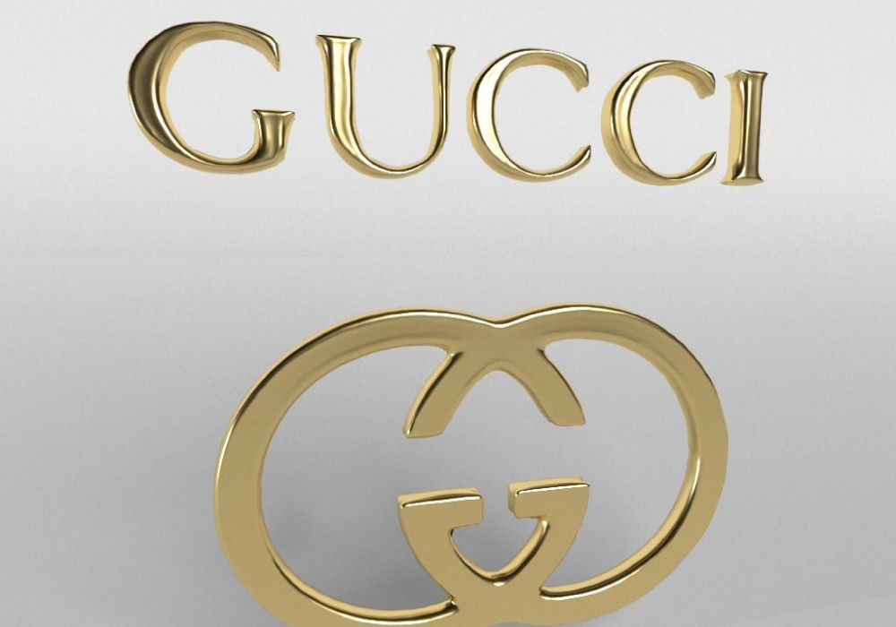
Gucci logo generally represents the full name - Guccio Gucci of the founder.
His son Aldo Gucci in the year 1933 thought to come up with a double combination of letters. So he further artistically designed the logo by doubling the letter G.
It seemed a classic and memorable one for the fashion industry. It stabilized its authenticity in the world.
It attracts the attention of the audience more than the long business names. It asks the people to pay their attention to it, and enquire more about it. The monograms are versatile in their look, which speaks to a wide range of clients. It becomes useful for its family business as well. It emphasizes values properly hidden behind the business and brings an emotional connection with the clients.
Presentation is one of the major elements required to design the Monograms. Businesses and professional firms use presentations to inform, educate, motivate and persuade internal and external audiences. So it is crucial to have a good presentation to enable a logo to become memorable.
A good presentation marks its uniqueness in the logo design, which consists of a wow factor, that stretches the progress of any company towards great heights. Without this factor, the logo cannot be relevant to the interest of the customers; because the perfect presentation of the logo is very powerful because it can influence the mood and emotions of the customers.
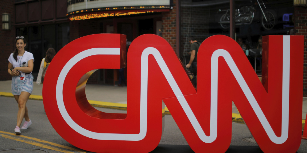
The CNN logo represents leadership quality with a wide approach. The company was founded in 1980, owned by Time Warner.
Its logo remained unique and maintained its significance and its elegant look throughout the years.
It is exceptional in its look and achieved a distinct place in the world. It is simple and highlights uniqueness.
It attracts the attention of the audience more than the long business names and attracts the attention of the customers.
It makes the logo unique and gives the audience a different image of the brand. It has the power to steal ones heart amusingly, but it should be relevant with the interest of the audience too.
Lettermarks shows their uniqueness in the use of abbreviations, which shows the concept of hidden messages.
Many of the lettermarks use the concept of hidden message and add it to the logo, which gives it an ideal look. It should be fascinating for the audience, which will deliver the desired results.
A typical logo only contains an icon or symbol and an along with the hidden message, which would attract the attention of maximum customers.
When you design a logo for your business, it should always be done by thinking about the interest of the audience in mind.
When an industry thinks to highlight the brand message with only a few letters, then it opts for the lettermarks. This helps to convey to the customers about the brand values in the simplest manner, along with attracting their attention to the fullest.
It uniquely marks their simplicity, hence considered as the choice of most of the designers. Any organization does not want its logo to look unforgettable, which would lack in communicating the brand identity. So when a company needs a concise and precise one, then it always goes with the Lettermarks.
It attracts the attention of the audience more than the long business names. It asks the people to pay their attention to it, and enquire more about it. The monograms are versatile in their look, which speaks to a wide range of clients. It becomes useful for its family business as well. It emphasizes values properly hidden behind the business and brings an emotional connection with the clients.
[The images are being taken from the registered companies and belong to their respective owners only.]
Submit Design
Height and Width should be the same (e.g. 1000 x 1000)
Supported file formats : .JPG / .JEPG / .PNG

Submitting...
Submit Design