Notifications
Logout
Are you sure want to logout?
Yes
No
Notifications


Full Name
Enter full name
Contact Number
Enter contact number
Enter valid contact number
Email Address
Enter email address
Enter valid email address

19 Oct 2021
19 Oct 2021
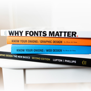
What is Typography? Started getting a set of questions in your mind? Now you might be thinking about what the term refers to; does it refers to the classification?
When we move on towards some unusual things, we get some kind of knowledge that adds exceptional essence to our mind, which helps us to stand out from the crowd.
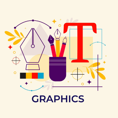
In this blog, let us study typography in terms of fonts that are always used by everyone, but studied and recognized by few.
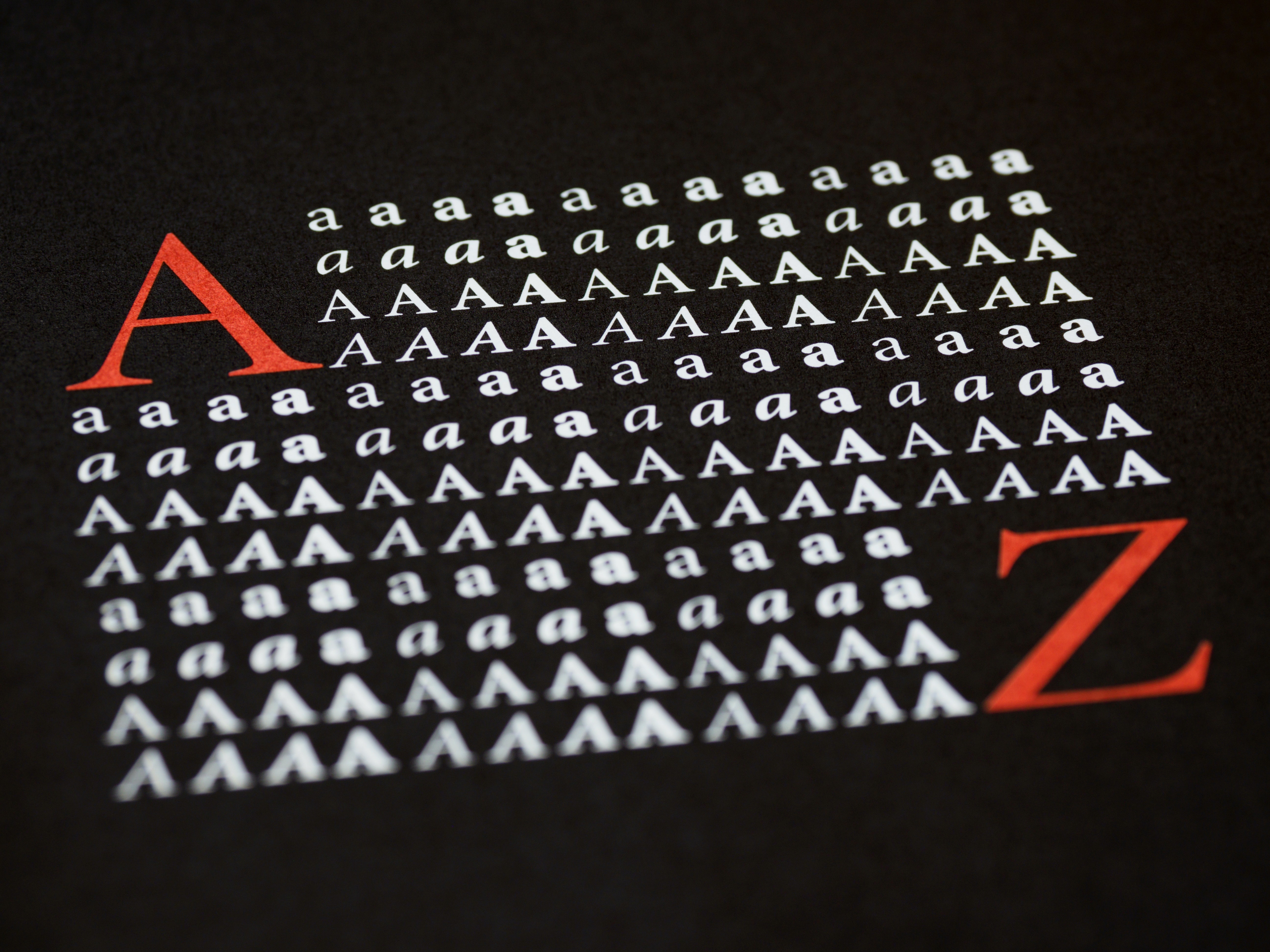
Typography is an artistic methodology of presenting the written language legible, readable, attractive, and appealing when displayed. The term is also applied to the style, design, practice, arrangement, and appearance of the letters, numbers as well as symbols created by the activity.
It includes the elements like the size of the letters, line length, and spacing on a line. Its ultimate goal is to create a text that is easy to read, precise, concise, attractive, and appealing to look at, which would increase the productivity of the business, brand, and product.
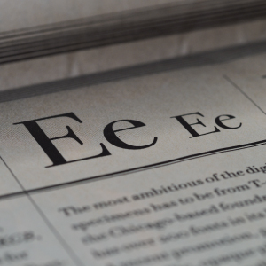
Typeface and font could be considered as the two elements of typographical symbols and characters. Before switching on towards to the types, let us have a glimpse of what is the Typeface and Font.
A Typeface is considered as a set of typographical symbols and characters, that include letters, numbers, and other characters, that add essence to the fonts. Whereas font is the complete character set within a typeface, that is often of a particular size and style.
These are referred to as the four main types of fonts, as the other are just variations of these types. Let us move on to the fonts that are used but never studied, these are:
It is old, but the most gold font, which always lasts on the top list. It has its origin from the carvings made by the Roman in ancient times. It relates to the two theories, which shows why the Romans had serifs on their letters. The first theory highlights the carving of letters into the stones, and the stone carvers crafted the serifs while following the outlines of the letters. The second theory signifies the use of serifs was deliberate and they were used to make the ending lines neat, clean, and broad.
Letters with serifs became default; having its invention when Gutenberg invented the movable type printing press, the books were printed in letters with serifs. Because of their origin, serif is associated with the old and traditional way.
It shows the attribute of being unique that this font can be just identified as a perfect logo or web design. Along with every design element, we should ask ourselves which font would be the best fit for the logo design, that attracts the maximum audience. Here comes the serif, which seems to be cool to use.
As in any design area, choosing design elements all comes down to the audience and brief. There is still plenty of people who will be drawn to a serif logo, as it may help us to stand out. It is considered the perfect design shorthand for conveying history and formality.
When there comes the concept of minimalism, then there comes the need for clean, simple, and appealing fonts to get appear in the eyes of people. Here comes the role of serif that enters the stage. These are not associated with serif fonts. They look more modern and stylish.
These sans serifs show variations to a wide extent, depending on the period when they were made and their appearance. These have their origination in the 19th century and are mostly used by the people. Their appearance works perfectly with the modern web design. It shows its clear look when used for web articles. They enable cleaner-looking, appealing text and increased readability.
The serifs can be tricky for scalable logos. The original purpose of serif might be a practical choice as well as an aesthetic, that would help to attract a wide range of customers. If a company designs a print document, like newsletters or magazines, corporate documents, or a whole book, these plays the role of friends, because the more text you have got to deal with the easier serif will make it to read.
These can be tricky to read on small devices, but could be considered as a good option is to go with a monogram of a single serif letter, which will stay legible. It works because the serifs help the eyes flow with the attraction and make each letter stand out.
These probably show their origination in the handwriting style. They have very limited use in the field of web designing. They do not work in the field of body text. They show their use in really short phrases and titles.
They do not have much in common aside from the fact they look very elegant. The brush strokes vary from font to font, as well as widths and the way the letters are drawn. We can find them mostly on the logos of sophisticated restaurants, beauty brand logos, packages, and posters, that brings eye-catchy feeling to the customers, ultimately taking the industry to the height of success.
They are pretty versatile, and can also be used for a bunch of other things which makes them a great part of the design industry.
These have a sense of elegance and sophistication associated with them, which adds appealing beauty to the logos. These could enable any business to work smartly rather than effortfully, which would help to make things easier. These are considered as the best option for the page that is on the way, which adds a wow feel to the logo designs.
These are also called decorative fonts, as they show their presence on the front side. These are the most diverse, and decorative group that created attributes in themselves, and creates an image in the eyes of people.
The fonts that belong to the family of the decorative group vary in appearance to a great level. These can be used to support either formal or informal designs. In addition, their pleasing, charming form builds up prominency in the family of typography. They have become most popular since the invention of web fonts.
These are engaged with the adorning and beautifying adjectives. They enhance their glory and look pretty in any project. These are designed for specific purposes or only with a theme in mind.
Why Fonts Matter? Do you know the concept behind it? Yes, or No? Let us find the answer pleasing and unique way?
When the fonts are used in a precise manner, typography can convey a certain emotion. It could be used to convey the right message to the audience, which would help to understand the concept behind the brand or product. The simple presentation of the fonts build the tone, and appearance of the Brand Name and Logo.
It avoids repetition of the same font that takes place in the presentation; rather it unifies all the designs, effects, wow factor, exceptional features that helps to build up the Brand Name. It synchronizes and links with the values and aspects of graphic designs that enable the company to walk efficiently on the pavement of progress.
The main aim of any font is that it should be properly visible to the human eye, clean, medium-sized, and alluring. The fonts that could be easily read acquire prominence in the marketing strategy. It also helps readers to perceive information from the text, along with adding value.
Its creativity adds essence to the content and of design, which ultimately helps to escalate the business.
The fonts we use in the presentation are the visuals that the audience will remember most. When the company needs the brand identity recognized at any place in the market; then Typography plays a major role in building up the brand value.
Using fonts that are clean and easy to read is key to any presentation. If they are too small or complicated, then the project will be removed from the appealing list. So they should be able to easily comprehend what the company, brand, or product is trying to express.
The correct addition of typography in a design project reflects the great professionalism of the business or brand. It also helps in gaining the trust of the consumers, which would help in the growth of the brand, by bringing progress in hundredfold. The professional approach of design includes typography at its peak.
When we talk about the advertisement or show the exciting features of the game; that time we need to design content that is fun, playful, and glamorous. When the content requires some seriousness, then a business look for fonts that are simple, plain, and professional. The choice of such typeface determines how the content is understood.
Graphic Designs lacks in conveying messages if they are not properly equipped with typography. Typography has a long-lasting effect on the mind of people. These are crucial to creating their personality, along with highlighting the significance of the brand. It masters the content used to describe the brand names, logo concepts, and many more. It helps to build the status and body language which makes the first impression, and character of the site, which reinforces that what the words say about the company. That is why typography plays a significant role in building significance.
Submit Design
Height and Width should be the same (e.g. 1000 x 1000)
Supported file formats : .JPG / .JEPG / .PNG

Submitting...
Submit Design