Notifications
Logout
Are you sure want to logout?
Yes
No
Notifications


Full Name
Enter full name
Contact Number
Enter contact number
Enter valid contact number
Email Address
Enter email address
Enter valid email address

14 Dec 2021
14 Dec 2021
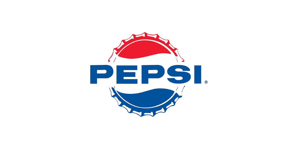
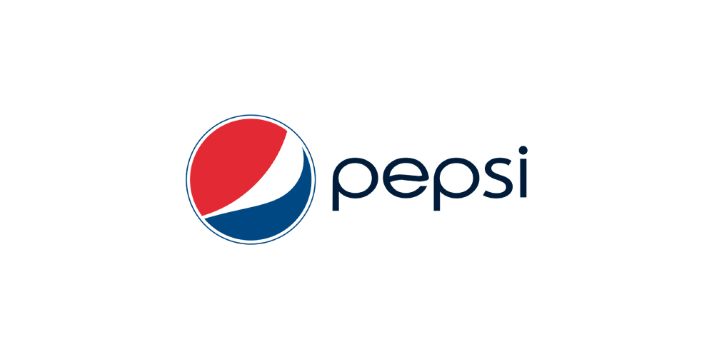
Pepsi is the type of Iconic Based Logos. The Pepsi Globe is the logo for Pepsi, named for the red, white, and blue design in a sphere-like shape. The top half is red, the bottom half is blue, and a wavy white line runs through the center. It is claimed that the new one represents Earth as a magnetic field, feng shui, Pythagoras, geodynamics, renaissance, and more.
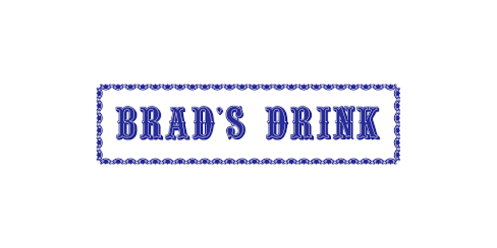
Pepsi got the name of its inventory, Caleb Bradham, and was called Brads Drink.
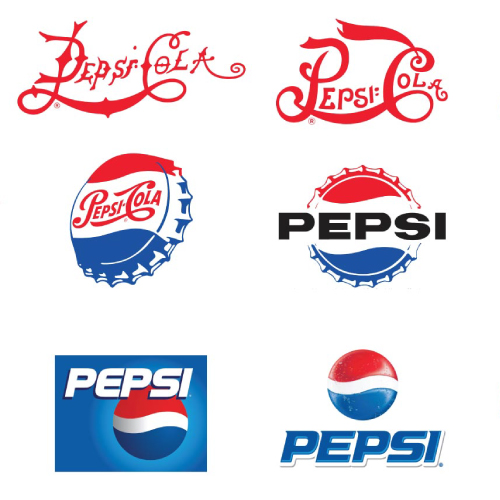
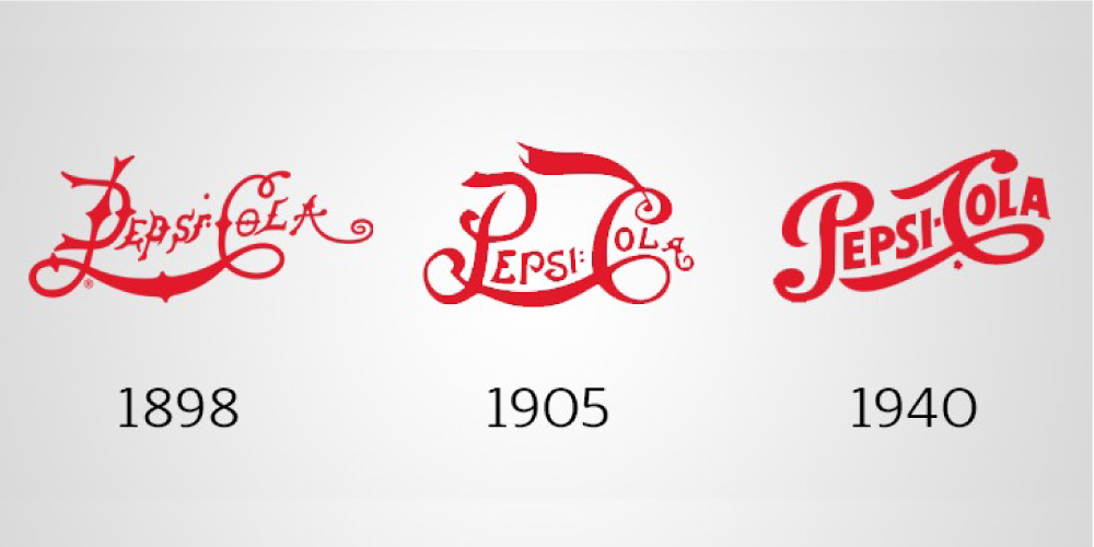
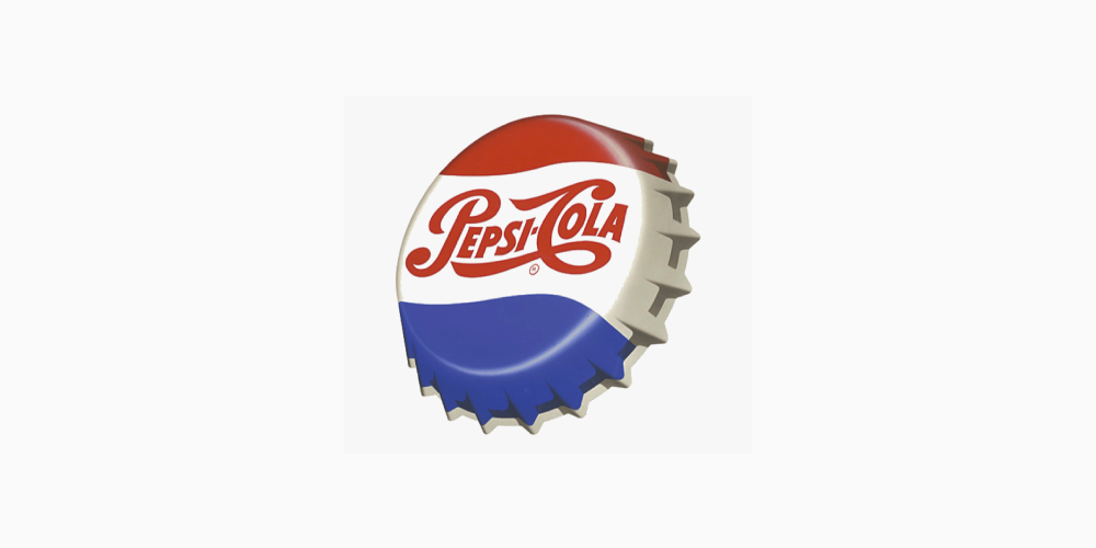
The old Pepsi logo was designed as the white script on red and got stuck with the color scheme from 1898 to 1940.
This design is appealing and sharp to be seen, changed over time to the familiar Pepsi colors, and white and red have remained a major element of the design, which made it a unique identity.
It was well planned and executed properly, which offered visual consistency all through the marketing strategy, which helps in building the identity of the industry and improving its brand recognition.
This consistency and uniformity projected a professional image of the business that a large audience.
Pepsi participated in the competition to make itself look simple and unique. It took steps to set itself apart from the competitor in the market.
Its style is associated with the exceptionality to keep its image appealing with the times and take on a more classy look. It remains with its originality and true colors.
The logo of Pepsi-Cola came with a very strange font style. It consisted the thin letters which brought a good feel to its design and created an appealing look to attract the attention of the people.
It was getting marketed as a health aid for digestion, and the drink was given the tagline was, Exhilarating, Invigorating, Aids Digestion, accordingly. The letters in the logo started showing much more spacing with the simplicity of smooth words.
It got associated with the smooth words by 1940. It showed the clean-cut letters with a more thinned-out version, and the fonts brought an innovative eye-catchy look.
The name of Pepsi-Cola was already written on the appealing wave, which brought the motion and energy of the element that continues throughout the lifetime of the Pepsi brand.
It always tried the best of its efforts to remain out from the crowd, so it came up with the Red color and similar fonts to Coca-Cola.
This is the conceptual one that has a big picture. It was designed in a unique way to express something specific about the business of an organization from the other.
It was stylized with the tagline - More bounce to the ounce. One can do well with a simple logo that would attract a large number of consumers at a time.
This creates a strong bright-colored impact which is mandatory because it helps a brand to gets stick in the mind of the consumers. They always strive to be unique. It dictates the personality of the brand and tone in a respectful way.
It looked good, but later they need to get redesigned, which would provide it an exceptional design for the audience.
The company dropped Cola from its name, and also left the script font elements.
It got formed with a completely different look and established a brand different style and look.
It maintained its exceptional wavy lines format. It enables the logo to become memorable by showing its bright design in a timeless and precise manner. Henceforth, leading it to become versatile by having appealing designs
Pepsi got associated with the taste of youth during the 60s, and brought enthusiasm to their lives.
Later on, it got combined with Frito Lay Inc. and established the company PepsiCo Inc.
It made the logo versatile is to think about what format could be used to make it appealing to the consumers.
The fairly simple design came in the flat style. When there comes the concept of minimalism, then there comes the need for clean, simple, and appealing fonts to get appear in the eyes of people.
Here comes the need for appealing fonts to catch the attention of customers. It worked with straightforward font sans serif fonts.
It showed variations to a wide extent, depending on the period when they were made and their appearance.
It also changed its colors from the harsh black to match the blue energy of the lower wave. Their appearance works perfectly with modernity and shows its clear look when used in the market. They enable cleaner-looking, appealing images, and increased readability.
Pepsi dissociated the brand name out of the wavy globe in 1991. The white line of the wavy globe again came up with a narrow shape like the previous logo versions.
It showcases its personality concisely and effectively to its audience. It was simple logos that have an elegant and sharp design associated along with it, which have the power to steal ones heart amusingly.
It does not change its design style and fonts. Rather it took the Red banner element with a more prominent version than in the 70s. It appeared in the italicized font for the audience, and the Red and blue dominated the Pepsi logo, and white made a comeback as a color for backspace.
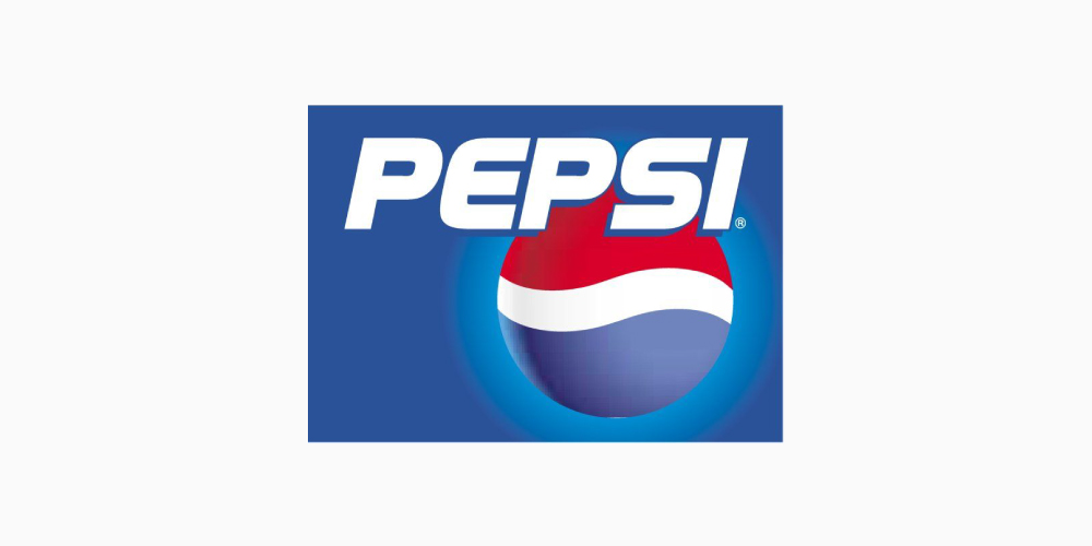
The brand took the 3D logo to show the differently unique version. Its Blue color became dominant for the first time, which related with the trust, honesty, and helped to build customer loyalty with the product or brand.
It highlighted added the elegant and sharp look by shifting the background to a horizontal gradient to the Pepsi emblem.
The typeface got changed to a serif for the first time and associated a blue line with it.
It was filled with the light gray shading within the letters, which helped it to stand out from the crowd as 3D elements as well.
It could directly evacuate a place for itself in the heart of any person. When the audience can easily recall the brand, they get more brightly connected by themselves to the brand.
This was the year when the company decided to go with a simple, clear, and elegant design which would reveal the beauty to make it eye-catchy for its audience.
It shifted itself with something elegant mesmerizing style of the rising wave. Its design got flattened and made simple in its look.
The 3D stylized its logo like a globe and made it flat again. It did not contain serif typeface, and uppercase letters, and not even the symmetrical band across the globe.
It then gets its title at its side, which shows a band, that was wide in its look and where the globe faced upward and thinner toward the bottom.
This was the year when the logo was stylized with no outline around its globe. It represents the brand today in the wavy form, which implies the minimalist design elements that show the structure of the circle. It is convenient to represent the brand elements simply and clearly.
It tends to attract the attention of the youth, and make them familiar with the brand. It had a combination of bright colors which made it looks bright to the eyes of the customers.
This creates a strong bright-colored impact which is mandatory because it helps a brand to get stick in the mind of the consumers. It shows the perfect color combination, which is very powerful and it can influence the mood and emotions of the customers.
It consisted Red, White, and Blue colored spiral shapes into their logo. These colors were selected to show the support of the company of the American troops. These shapes symbolized the globe, which ultimately highlighted Pepsi as a global brand.
The swirling shape symbolizes the water. As the Ancient Egyptians and several other civilizations always represented the water wavy and swirling symbols and lines. So Pepsi too used represented water in its logo with the wavy and swirling symbols in the globe.
The three-part logo, with Red color in the top part that represents its values aligned with the power of the industry, its passion to walk on the pavement of success, and energy to boost the business to the peak of success; the color at the bottom is the most universally favored color, i.e. is the Blue color, which is of all and therefore the safest to use in terms of business, that relates to trust, honesty, and dependability.
Therefore helping to build customer loyalty with the product or brand; it is separated by the wavy White line, that represents purity, innocence, clean, fresh and simplicity in a positive manner. All the colors represent the magnetic field of Earth, as well as feng shui, Pythagoras Geodynamics, The theory of relativity, and also the Golden ratio.
[The images are being taken from the registered companies and belong to their respective owners only.]
Submit Design
Height and Width should be the same (e.g. 1000 x 1000)
Supported file formats : .JPG / .JEPG / .PNG

Submitting...
Submit Design