Notifications
Logout
Are you sure want to logout?
Yes
No
Notifications


Full Name
Enter full name
Contact Number
Enter contact number
Enter valid contact number
Email Address
Enter email address
Enter valid email address

18 Nov 2021
18 Nov 2021
All of us are aware about Apple Inc. designs manufacture and markets smartphones, personal computers, tablets, accessories, and many more things. It sells a variety of services that includes products iPhone, Mac, iPad, and Wearables, Home, and Accessories. iPhone is considered as the line of smartphones based on its iOS operating system.
But how many of us are aware of the concept behind the logo of this exceptional iPhone? Are you aware of it? No? Let us go through the concept that marks its evolution.
There also arises some concept that asks, Which attributes make a logo good? Are there any other attributes too that make it good? There is a spectrum of questions that a person gets while thinking about a logo. Let us think and find the answers.
We know that Apple Inc. is an American multinational technology company that consists the bitten Apple which is well-known in the world. It is one of the highly reputed and recognizable logos in the world, that perfectly symbolizes the clear picture. It brings the customers to deal with real-world objects.
It shows the symbolism of knowledge and clarity. Its use is extremely powerful and highlights the engaging nature. It shows the strong connectivity that brings luxurious nature to the business.
Apple belongs to the category of Brand marks or Pictorial Mark of Iconic Logo. These are made of a graphic design i.e. symbol or object which represents a real-world object. As simplicity reveals beauty so it should be straightforward, like the outline of an Apple phone. This would showcase the efforts of an organization in a beautiful way. The great attribute and advantage of the brand marks are that they are easy to remember even after a long period. They are associated with real-world objects. A brand mark is often used as a hallmark of a company that is considered iconic. It is always represented clearly to communicate clear concepts with the consumers or audience.
If we sit beneath the Tree in our leisure, and fruit fall, then what would we do? We would approach and pick it up to have it. But it was Sir Isaac Newton who observed realistically observed the Apples falling from a tree and realized that the force produced by a falling apple is equal to its mass times the gravitational pull of the Earth. He established the analysis and the theory to predict forces and resulting motion.
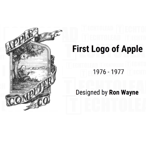
During the incorporation of the industry in the era of the 1970s, the Co-founder of Apple Computer, Ronald Wayne, brought the creation of the first logo of Apple. It was different in comparison with the current one.
Ronald Wayne got inspired by the theory led by Isaac Newton, which came forth after the falling of Apple, (that states - any particle of matter in the universe attracts any other with a force varying directly as the product of the masses and inversely as the square of the distance between them) which inspired Ronald Wayne to bring the Apple logo.
In the year 1976, Ronald Wayne designed the first logo. He got engaged with the services of Job Janoff, who held the post of a Corporate Logo Designer in the year 1977. The logo had its association with real-world objects.
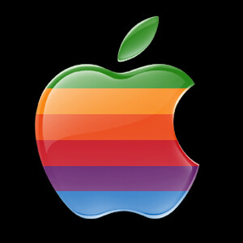
The above design concept lasted only for a few years, and Rob Janoff was asked to again come up with something more stylized form of Logo. His step would go on to become one among the highly renowned ones. Janoff stated that the bite was aligned to convey to the people that it represented an Apple and not Cherry or Tomato. It signifies good fortune and future happiness, which would help the company to take it to the highest peak, along with maintaining its originality.
Some people see a rainbow as a sign of a new beginning. Hence, its association with the logo marks the new modification that engages the people with the industry, which would ultimately bring strong bonds and communication. It also symbolizes the promise that emerges from a sign of good luck. This could also indicate the treasure that brings prosperity to the industry hundredfold. It also shows the sign of equality with the gathering of all clients together. It also symbolizes the peace, that arises the feeling of calmness with relaxation.
Steve Jobs found the concept of Newton as outdated. Here came the need for a new one that would be appealing, and would help to bring creativity to the design. Rob Janoff, got the opportunity to show their artistic talent to the world. By availing the benefit of the opportunity, Rob Janoff created a classy-looking and unique form of it. This got its establishment in the mind of the people.
It showed the spectrum of the Rainbow spectrum, which signified the Energy, passion, power, wealth, stability, and prosperity that brings royalty, wisdom, and sophistication to the industry. The research says that Janoff placed the Green color at the top, to show the greenery associated with the leaf.
Its overall state, remained unchanged since its establishment, and founded its roots with prosperity, and created a royal vision in the eyes of the people.
The values of the concept are aligned with the power of the industry, its passion to walk on the pavement of success, and its energy to boost the business to the peak of success. It relates to trust, honesty, and dependability, therefore helping to build customer loyalty with the product or brand.
Steve Jobs was always trying to look for a new modification with the design. He was looking for bringing a unique style to the concept. After the rainbow effect in the previous one, which last for many years, there was a time to bring a new one.
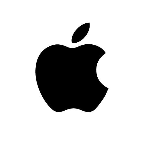
Simplicity marks beauty when as it shows uniqueness. After returning to Apple, in 1997, Steve Jobs wanted to build the identity of Apple get recognized universally.
Though there was a unique Rainbow associated with the Iconic Logo, it needed to be brought change with the modern style. Here came the need for a new concept that decided to bring the new form of bitten Apple in a Monochrome format.
Monotone refers to the use of only one color, that is particularly black and white. Monotone when used properly while designing, monotone colors deliver a result that is smooth, elegant, and gives relaxation to the eyes.
It deals with real communication with the audience. It does not contain any other effects, shadows, and shades. It shows its attribute in designing with a single color.
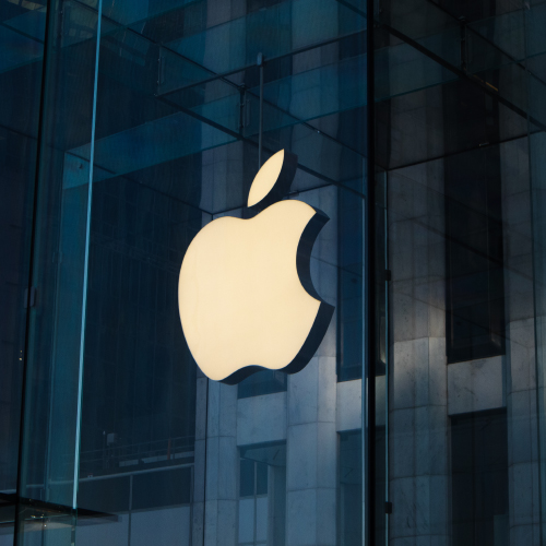
The company today uses a more modernized and conceptual flat Minimal form. It mainly highlights Three colors; Silver, White and Black. It has marked its presence amongst the famous logos in the world.
All of us know that it is the Logo that gives the brand identity. We all are aware of the iPhone that consists of the logo of bitten Apple. It shows a clear image of the brand. It attracts the attention of the customers. It helps to associate the maximum number of audiences with the brand. It helps to engage the people with a vision of the industry.
It is simple, unique, and straightforward which depicts the simplicity along with the professionality of the services. The current logo of Apple is a modern version of Apple. At the time of availing the benefits of the featured Apple phone, people never think about the history behind the concept.
It is generally used by industry to bring passion and energy to the business giving the devotion to work. They highlight the determination of the industry to satisfy its customers and ultimately raise the standard of the working culture.
This could also be considered as a powerful form of communication; that not only inspires but also makes a strong bond between customers and industry.
[The images are being taken from the registered companies and belong to their respective owners only.]
Submit Design
Height and Width should be the same (e.g. 1000 x 1000)
Supported file formats : .JPG / .JEPG / .PNG

Submitting...
Submit Design