Notifications
Logout
Are you sure want to logout?
Yes
No
Notifications


Full Name
Enter full name
Contact Number
Enter contact number
Enter valid contact number
Email Address
Enter email address
Enter valid email address

9 Oct 2021
9 Oct 2021
There exist an evolution of everything, and when it takes place then it shows variation in some features.
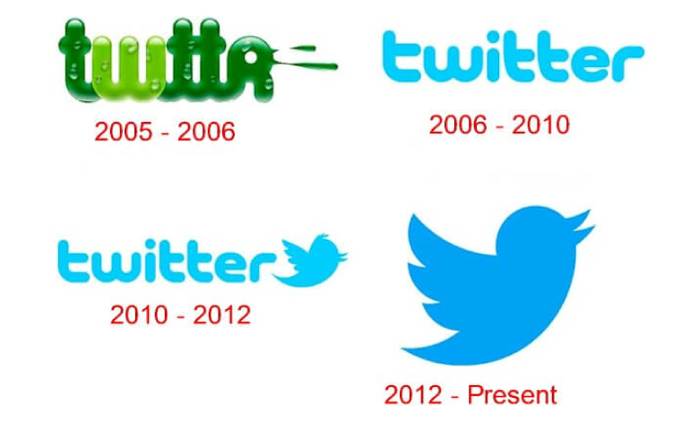
Technological evolution is a theory of radical transformation of society through technological development. The Twitter Bird logo came onto the scene in 2010.
The data shows that it had 206 million monetizable daily active users worldwide. When the users and non-users of the platform think about it, then they might get a bright image of Bird in front of their eyes. But how many people know about the concept behind its Logo? The answer is - the very rarest of the rare might know about the concept behind the tiny features.
Before directly moving towards the concept of the Twitter Logo; let us first have a look at the history behind the formation of the platform.
Jack Dorsey, the co-founder, in 2006, got a motive to create an SMS based communications platform in which friends from all over the world could be able to get connected providing worthful information, along with updating with some useful facts.
In the beginning, Twitter has its features that were related to texting. simultaneously, the idea evolved, in large part due to brainstorming sessions with Dorseys co-founder, Evan Williams. The day arrived and on March 21, 2006, Jack sent the first tweet, which read - just setting up my Twttr.
Here began the idea of sharing information with many people on a single platform. It could also signify sharing our views, ideas, or perspectives with others. As every person requires a name to get identified and recognized to the world in an appealing way, so there was a need of a logo to give an identity to the industry.
It reflects the essence of purity as Twitter sounds a lot like the tweet, which is a sound made by birds. A bird symbolizes freedom and endless possibilities. Short messages are delivered as fast as birds fly, hence the name given.
It was named Larry T Bird, with the inspiration being the basketball legend Larry Bird who played for the Bolton Celtics.
The co-founder Biz Stone, being from Boston himself and a fan of the Celtics, shown their innovative thoughts and selected the name which has become a brand in itself.
He has also been on record confirming the sporting legend was the inspiration. The concept did not start with the bird, but there have only been a few variants since the first version was done in 2006.
This was the year when its first official logo came into existence attracting a great audience. Designer Linda Gavin took very appreciable efforts to create it. It was a Wordmark Logo that was revealing beauty from its simplicity, with an exceptionally rounded typeface, along with the letters in small caps and no spacing between them.
It shows its main point of focus in simple and clear vision. Its design enabled the users to take travel throughout its website to know about it. The sky-blue color highlighted the open space for the audience to come and share their knowledge and thoughts in a frank way. This had continued to maintain for about four years before the introduction of the Twitter bird.
Four years later of the
The bird was made in the form of a Wordmark Logo which helped to create strong recognition in the market. Its image remained unchanged except for the color that switched to black.
The year 2012 was the year of Modern Bird. When the artistic department of Twitter found the need to revitalize the image of the brand by giving its emphasis on its simplicity in an engaging way.
Later on, Twitter Log built its roots with prominent Logos and became popular all around the world. It signed its identity in a way that did not seem the need the company name. The name was dropped, and the only logo, later on, became the name of the company.
It was designed in a way that gave it a straightforward look. The designers explored their way with the previous feathers of the bird along with the three overlapping circles that shaped the wings.
The team took efforts to enlarge its icon and switched to a darker shade of blue, which made it captivating in every aspect, particularly on the white background of web pages.
The characteristics changes of the Logo brought a gradual development in its fame that it built up its roots with the prominency.
The current Twitter logo is made in the form of a hummingbird which is in the form of fluttering. It was designed by artist Martin Grasser who had just graduated when he was hired for the designing task.
The illustration was featured with 15 circles layered on top of each other. This geometric approach gave it a shape to each of the parts of the bird - the wings, the head, the beaks, and the belly.
Back in 2006, it was a simple Twitter wordmark that used the rounded sans-serif font. This roundedness seems to have been the inspiration for the design of the bird that was to make its appearance later.
Its first version came into existence in 2010, which added some sauce to the logotype, but nothing could beat the refined image introduced in 2012. The outlines of perfect circles shaped its rounded belly and wings. Every aspect of the bird, including the beak, was drawn from circular arcs of precise geometry giving it a straightforward nature.
It originally came in a Light Blue shade. As Blue has proved to be a popular choice among website properties, particularly social networking platforms, so the initiative helped in the prosperity of the industry hundredfold.
In 2010, the logotype was changed to black, with the bird icon taking on the blue from the logotype.
The 2012 variant brought a few blue darker shades, to add some contrast against the regular white background. While the shade would still be classified as light blue, it is a bit closer to true blue than the previous aquamarine.
In 2012. the text version of the logo was brought to an end. The first two logo versions used a custom rounded bubble font face created by Linda Gavin and the company explained the reason, that there was no more need for text to represent Twitter.
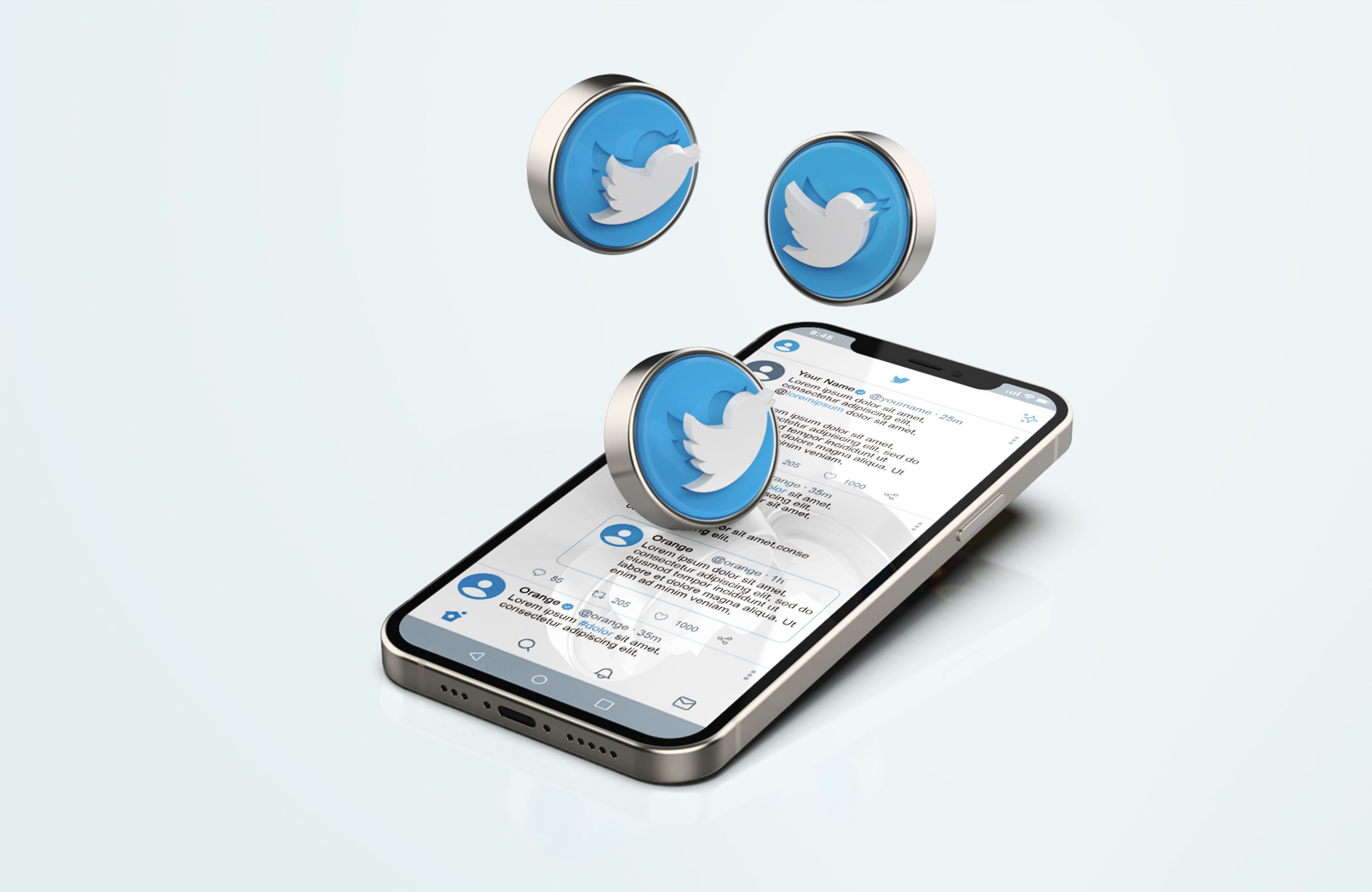
Twitter can be a very helpful platform for growing a following and providing the audience with valuable content before they even become customers. The character limit can also help to create quick-and-compelling advertisements. It could be used to advertise the products or services as well.
Additionally, any company can use Twitter to connect with the audience in personal and meaningful ways. If someone mentions one of the products or services, one can like or retweet their comment. Alternatively, if a customer complains about your services on the platform, then the industry or company can reach out to solve the obstacle in real-time.
Birds are widely regarded as symbols of freedom and eternity due to their ability to soar high in the sky. The bird is associated with the ability to focus on one goal without getting distracted by other issues on the side. It also symbolizes the need to develop become free from all the negativity.
There is little doubt that the bird logo has played a significant role in the success of the company. It was the focus on simplicity that drove people to the platform in the first place. The logo of the bird gave feathers to the industry in a consistent way, that it helps to soar high in the sky, which could never stop. The logo has always been a part of the elements that communicate its efforts to its users.
[The images are being taken from the registered companies and belong to their respective owners only.]
Submit Design
Height and Width should be the same (e.g. 1000 x 1000)
Supported file formats : .JPG / .JEPG / .PNG

Submitting...
Submit Design