Notifications
Logout
Are you sure want to logout?
Yes
No
Notifications


Full Name
Enter full name
Contact Number
Enter contact number
Enter valid contact number
Email Address
Enter email address
Enter valid email address

4 Jan 2022
4 Jan 2022
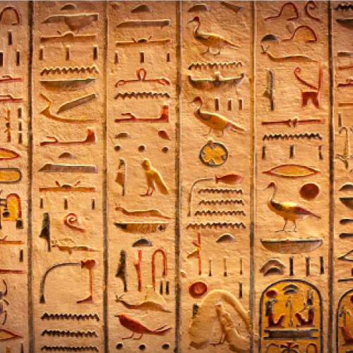
In the previous blogs, we studied the History of ancient logos, then some medieval logos. Now let us study the History and origin of some modern logos, that began their journey at the beginning of the 19th century.
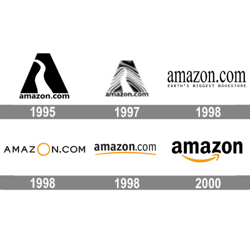
The first logo of Amazon came into existence, during year 1995. It was appealing, with proper typography, consisting of the bright-colored arrow, that was associated with a smile.
It interpreted the name of the company, with a Blue background and the letter - A with a shape of a river inside, along with a caption to highlight the goals of the company, ultimately aiming to show that the brand is the Earths biggest bookstore.
It replaced its design in 1997 and was constructed in a well-constructed version that reflected the growth of the company.
Immediately after one year, it again went into some changes and included the name Amazon, which showed the more elegant feature of it.
Between 1998-2000, it dropped its upper case and move towards the lower case version, and during 2000, it came up with a smiley face which starts from the letter A to the letter Z that ended with an arrow, which indicated that the company intends to serve its customers with all the products and services.
After going through many significant changes, finally the logo expanded with the digital world with no more limitations and highlighted the appealing design.
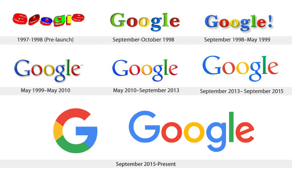
The logo of Google firstly marked its presence in the year 1997, with very bright colors. It was the year 1999 to 2010, when the brand went from evolution. The brand again came up with the final design in one of the most minimal styles.
Its official logo came into existence from period, 1999 to 2010. And in 2000, it came up with a new style with bright colors and attractive typography.
The industry grabs the attention of the people with the help of these inspiring colors because the colors speak their language. It is generally used by industry to bring passion and energy to the business giving the devotion to work.
They highlight the determination of the industry to satisfy its customers and ultimately raising the standard of the working culture. This could also be considered as a powerful form of communication; that not only inspires but also makes a strong bond between customers and industry.
It is the type of Wordmark Logo and appears in numerous settings to identify the search engine company. Google has used several logos over its history. It is supposed to symbolize that they do not play by the rules and know how to have fun. They chose to convey their message with color.
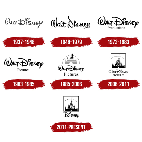
The design of the modern logo of Disney began in the year 1937, which showed the profile of Mickey-Mouse.
It was animated as a logo, which attracted a wide range of audience towards it. It was appealing in nature, elegant and attractive.
It was a unique design that became memorable with the technological advancements in animations.
The logo of Disney conveyed innovations and animations within itself, and also evoked the imagination as we feel entering into the field of a new world, where there is no fight, jealousy, competition.
It shows the magic within itself, which brings playfulness within ones self. It also tends to bring smiles and cheers to our faces.
When the audience can easily recall your logo and brand, they get more brightly connected by themselves to the brand.
When the audience can easily recall your logo and brand, they get more brightly connected by themselves to the brand. his creates a strong bright-colored impact which is mandatory because it helps a brand to get stick in the mind of the consumers. They always strive to be unique. It dictates the personality of the brand and tone in a respectful way.
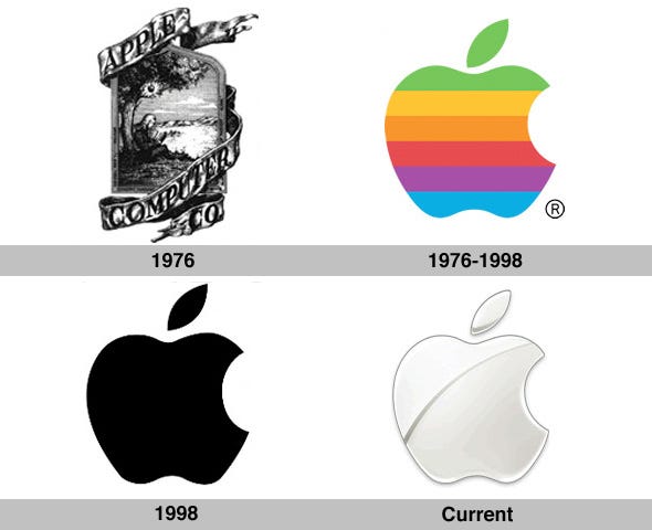
During the incorporation of the industry in the era of the 1970s, the Co-founder of Apple Computer, Ronald Wayne, brought the creation of the first logo of Apple. It was different in comparison with the current one.
It was the period between the year 1976 to 1998 when the same went through an evolution and took the form of a Rainbow.
It showed the spectrum of the Rainbow spectrum, which signified the Energy, passion, power, wealth, stability, and prosperity that brings royalty, wisdom, and sophistication to the industry.
The research says that Janoff placed the Green color at the top, to show the greenery associated with the leaf.
Its overall state, remained unchanged since its establishment, and founded its roots with prosperity, and created a royal vision in the eyes of the people.
Though there was a unique Rainbow associated with the Iconic Logo, it needed to be brought change with the modern style. Here came the need for a new concept that decided to bring the new form of bitten Apple in a Monochrome format.
It deals with real communication with the audience. It does not contain any other effects, shadows, and shades. It shows its attribute in designing with a single color.
The company today uses a more modernized and conceptual flat Minimal form. It mainly highlights Three colors; Silver, White and Black. It has marked its presence amongst the famous logos in the world.
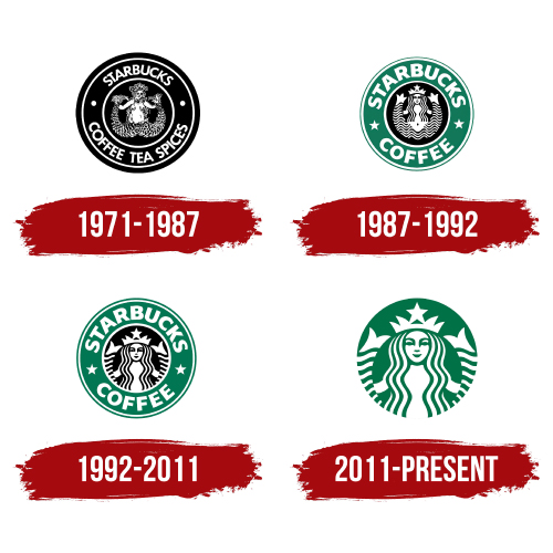
The logo first marked its presence in 1971 and became the identity of the brand. It consisted of a two-tailed mermaid or siren, and also had a wordmark around the circular badge.
It appeared with full details and small accents which brought the traditional look. The text written in block letters showed a modern sans-serif typeface.
It balanced the look of the mermaid inside the circle, along with the text on the thick edge of the circle, with the company name at the top, and it is also written Coffee Tea Spices on the bottom, and two white dots on each side of the word Tea.
In the year 1987, the brand came up with a new logo, with the addition of Green color highlighted in the round image of the siren. In 1992, the image of sirens was enlarged and extended, and the face was turned to a circle. Again, the brand redesigned the design and brought innovative changes to it, in 2011.
Starbucks was starting to sell more than just coffee drinks, to expand their business even further by offering their customers more product options. Today, Starbucks does not only sell coffee but also breakfast foods and tea.
The siren icon has stayed and will always be an important part of the brand identity design. Its visual identity has always made it stand out from the crowd. Starbucks has made a stable place in the market, making itself a brand by contributing the Coffee brand globally.
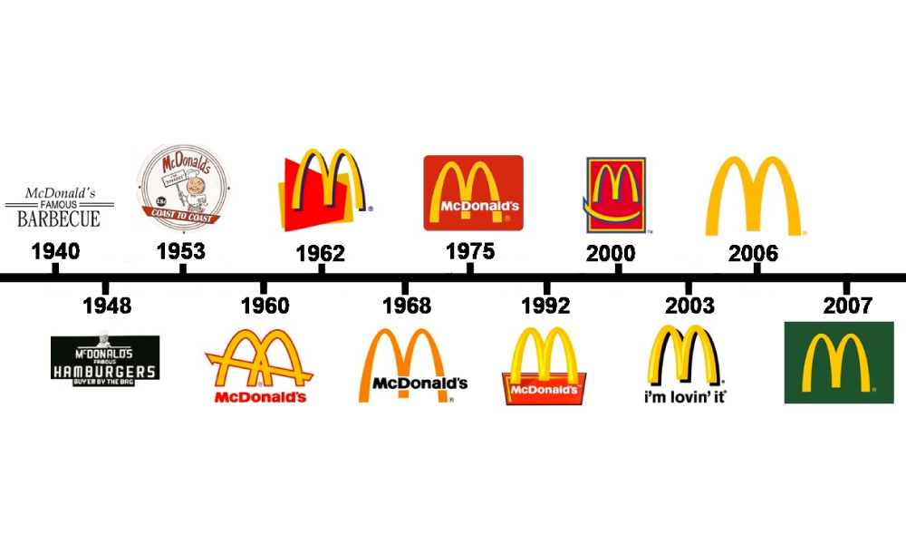
Its logo began its journey in the year 1940. Stanley Clark Meston innovated a project and created the famous Golden arches, which were stylized images of the restaurant of McDonald.
In the year 1961, Ray Crock decided to rebrand, and in 2003 the arches were given a cylindrical shape, and again a small arrow was attached to the cylindrical shape, and a small shadow was again attached to the letter - M.
It is an excellent example of a distinctive design. It is the simple and distinctive one that attracts a wide range of customers towards its business.
Two golden arches that create a unique letter M helps in making its identity around the world. It has a significant role in creating its brand image. Its famous arches form the part of its design.
Its logo indicates the symbolism of the golden arches that were the substance of the newly-constructed architecture of the first franchised restaurant in 1952.
It highlights the Golden and Red as primary colors, which represent the famous arches of its first franchised restaurant, while the Red color represents the food industry. It uses the McLawsuit font in its name. It inspires the customers in a great way that everyone looks up to it as a symbol of excellence.
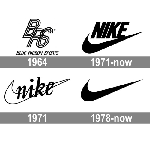
In the period from 1971 to 1978, the first designs of Carolyn Davidson did not catch Knight eye, then also he decided to use the same, and later Futura Bol replaced the cursive serif typeface in 1978, and new font appeared in a geometric shape, and the edge of - E went with the tail of the swoosh.
When the fonts are used in a precise manner, typography can convey a certain emotion. It could be used to convey the right message to the audience, which would help to understand the concept behind the brand or product.
The simple presentation of the fonts built the tone, and appearance of the Brand Name and Logo.
For a long time, it lasted inside a square but did not last for a long time.
It came up with the motto - Just do It, and in 1995 Nike came up with its new style of design.
Its logo becomes memorable and stands out from the crowd. It created a strong bright impact which is mandatory because it helps a brand to get stick in the mind of the consumers.
They always strive to be unique. It dictates the personality of the brand and tone in a respectful way.
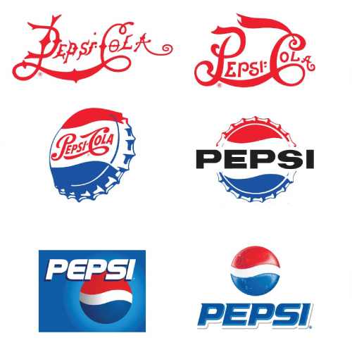
The old Pepsi logo was designed as the white script on red and got stuck with the color scheme from 1898 to 1940. In the year 1898 to 1940, the logo of Pepsi-Cola came with a very strange font style. It consisted the thin letters which brought a good feel to its design and created an appealing look to attract the attention of the people. It was getting marketed as a health aid for digestion, and the drink was given the tagline was, Exhilarating, Invigorating, Aids Digestion, accordingly. The letters started showing much more spacing with the simplicity of smooth words.
It got associated with the smooth words by 1940. It showed the clean-cut letters with a more thinned-out version, and the fonts brought an innovative eye-catchy look. It was the year 1950, when it tried the best of its efforts to remain out from the crowd, so it came up with the Red color and similar fonts to Coca-Cola. This is the conceptual one that has a big picture. It was designed in a unique way to express something specific about the business of an organization from the other. It was stylized with the tagline - More bounce to the ounce. One can do well with a simple design that would attract a large number of consumers at a time. In 1962, The company dropped Cola from its name, and also left the script font elements.
It got formed with a completely different look and established a brand different style and look. Pepsi got associated with the taste of youth during the 60s, and brought enthusiasm to their lives. The year 2014, was the year when the logo was stylized with no outline around its globe.
It represents the brand today in the wavy form, which implies the minimalist design elements that show the structure of the circle. It is convenient to represent the brand elements simply and clearly. It tends to attract the attention of the youth, and make them familiar with the brand. It had a combination of bright colors which made it looks bright to the eyes of the customers.
[The images are being taken from the registered companies and belong to their respective owners only.]
Submit Design
Height and Width should be the same (e.g. 1000 x 1000)
Supported file formats : .JPG / .JEPG / .PNG

Submitting...
Submit Design