Notifications
Logout
Are you sure want to logout?
Yes
No
Notifications


Full Name
Enter full name
Contact Number
Enter contact number
Enter valid contact number
Email Address
Enter email address
Enter valid email address

8 Aug 2022

8 Aug 2022
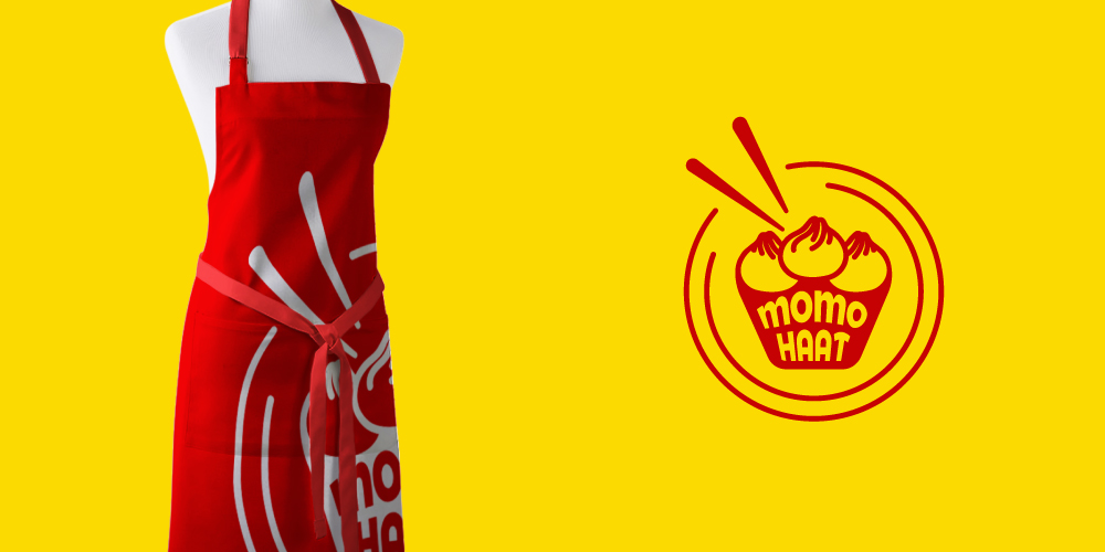
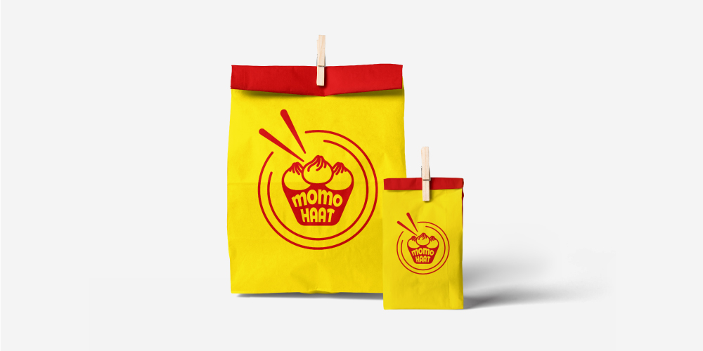
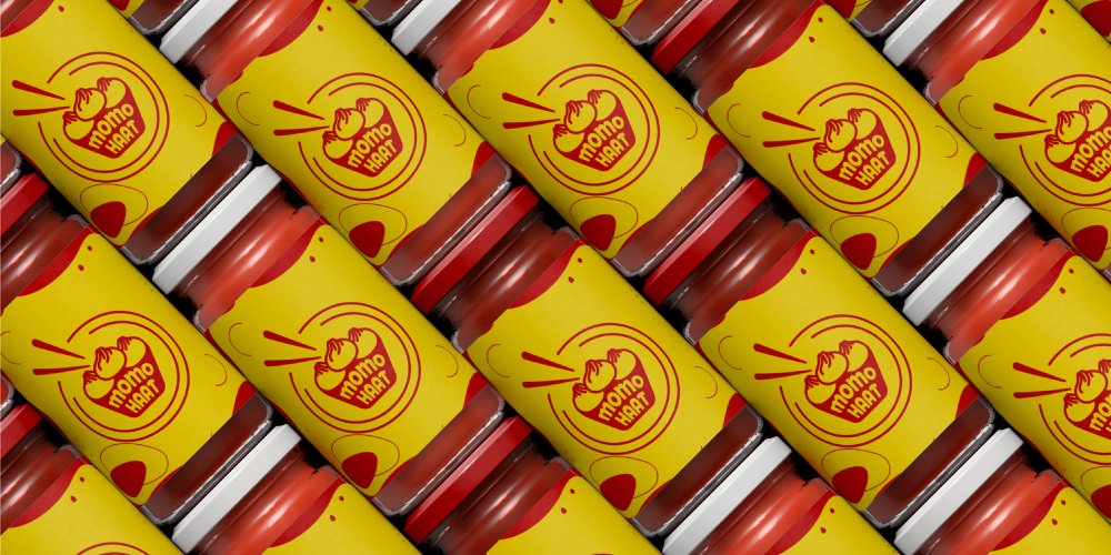
Momo Haat Logo represents Combination Mark Logo designed creatively. It shows a food bucket with momos and chopsticks. It represents a funky and foody look in a clean and elegant manner. This brings joy, and youthfulness to the fullest, ultimately reflecting happiness.
The Logo is associated with the School Bus Yellow color and the Guardsman Red color highlights passion, excitement, happiness, hope, and positivity sense of warmth.
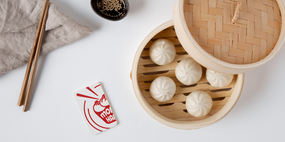
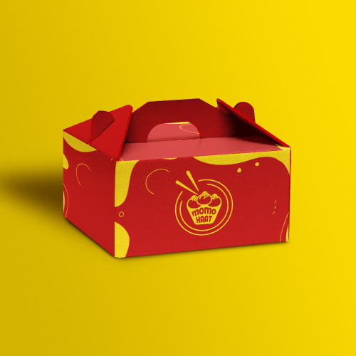
The restaurant business is competitive as it drives customers to dine and enjoy the place. Restaurants provide food and drink, marking their importance in offering delicious food to the customers and satisfying their needs.
A smartly designed menu offered at the restaurants brings joy and place a significant impact on the customers. The company aims to provide customers with high-quality food at restaurants. Restaurants and Hotels bring a delicious taste to the customers, which makes their mood delightful.
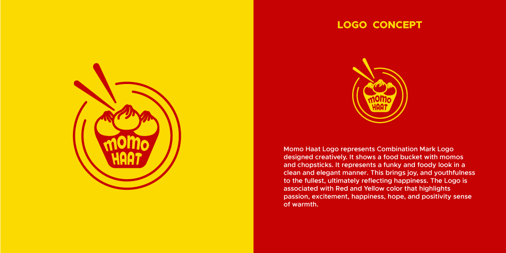
Momo Haat Logo represents Combination Mark Logo designed creatively. It shows a food bucket with momos and chopsticks. It represents a funky and foody look in a clean and elegant manner. This brings life, joy, and youthfulness to the fullest, ultimately reflecting happiness.
It is a memorable logo, which could be remembered even after a long time. The Logo is designed appealing, which goes with the business aspects in an exceptional manner. It occupy a place in the heart of the viewers and maintains its glimpse in the minds of people for a very long time.
It is appealing to the eyes, that traipse the attention of the people, and helps to stabilize it on the path of professionalism without affecting its uniqueness.
Momo Haat Logo represents Combination Mark Logo designed creatively. It shows a food bucket with momos and chopsticks. It represents a funky and foody look in a clean and elegant manner. This brings life, joy, and youthfulness to the fullest, ultimately reflecting happiness.
The Combination Mark logo is exceptional which shows the use of all the design elements in a proper manner, that traipse the attention of the people with the association of appealing colors, artistic design, elements typography, and creativity.
It is the Combination Mark logo design, which associates the combination of elements, typography, and design artistically and adds value to the logo design. It highlights the idea and concept in a clear, creative, and elegant manner.
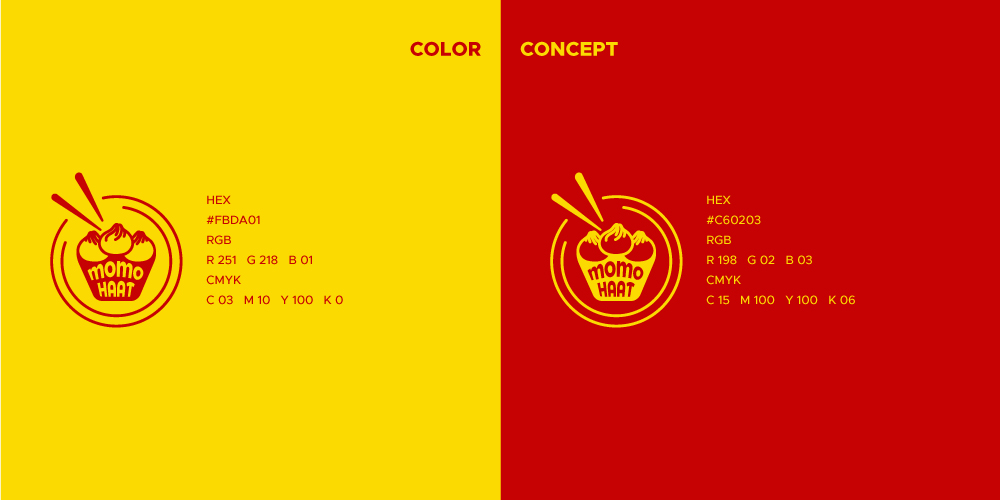
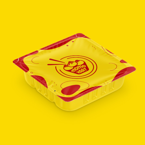
Momo Haat Logo is associated with School Bus Yellow color and Guardsman Red color that highlights passion, excitement, happiness, hope, and positivity sense of warmth.
Yellow is known for its attribute that is an attention-getter, and it highlights enthusiasm and enlightenment of the company or brand that highlights the passion with stability.
In practical terms, it highlights the silver lining of a cloud that removes the crestfallen nature. The color yellow is associated with warmth, sunshine, and positivity.
Red associated with the logo signifies the passion and excitement aligned with the business nature. It evokes the feel of excitement and highlights exceptionality, which shows its uniqueness. It shows the passion associated with the business nature, which satisfies the needs of the people. The association of both the colors with the design shows the artistic creation of the designer, which grabs the attention of the people.

Font plays a crucial role in delivering the right message to the target audience. It forms the foundation of a logo design that shows an ability to depict the values of the company in a positive manner.
The font plays an important role in denoting the tone of the text in an effective manner. Consider it to be a form of visual language.
In addition to the different types of the font used for particular purposes, the font in a logo design adds up the essence of a brand. Each typeface can communicate a different meaning with a different perspective. These can highlight the emotions of the industry as well.
Momo Haat is associated with Montserrat Font, which is a Sans-Serif typeface that is considered another appealing and worth-using family of Sans-Serif.
This font provides a distinctive perspective to the brand. Therefore, the typeface should always be inclined with the tone of the message the industry wants to convey through the fonts of the logo.
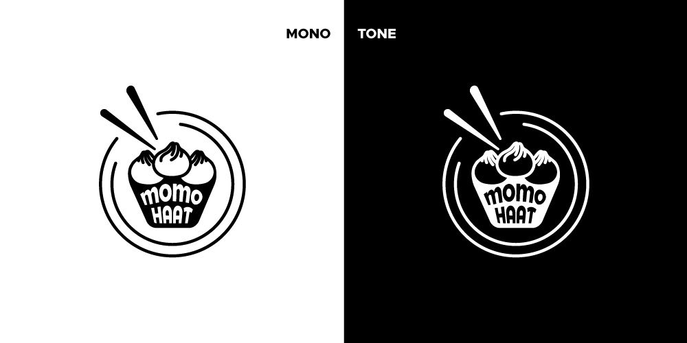
Monotone uses only one color in the logo, which is either Black color or White color, which are monochrome versions of the colored logo. It is not associated with any other contains or any other effects, shadows, or shades other than the single color.
It brings a clear, elegant, and clean look, and also gives a modern or minimalist feel to the logo design. These logos mark their importance in being used for printed products. The logo looks simple, bold, and clean with the monotone, and occupies a place in the list of memorable logos.

Submit Design
Height and Width should be the same (e.g. 1000 x 1000)
Supported file formats : .JPG / .JEPG / .PNG

Submitting...
Submit Design