Notifications
Logout
Are you sure want to logout?
Yes
No
Notifications


Full Name
Enter full name
Contact Number
Enter contact number
Enter valid contact number
Email Address
Enter email address
Enter valid email address
7 Dec 2021
7 Dec 2021
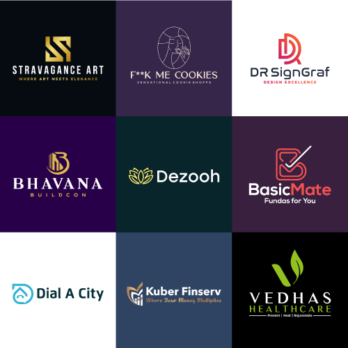
We have seen the top 9 logos of September and October 2021 and studied the concept of each. Let us look at the top nine logos of November 2021, created by the team of designers of 99Logos.
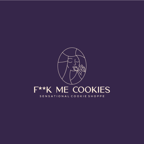
Cookies are liked by almost all ages of people and are consumed throughout the world for their nutritional value. Cookies are available in a wide range of shapes, colors, and tastes and are hence accepted by consumers of all age groups. These can be stored for longer durations. Cookies are the perfect snack if we have a lot of activity in the morning. Cookies are the ever-tasty and lip-smacking food item ruling the world without a stop. Most of us eat cookies for taste and they never fail to satisfy our sweet hunger. F**K Me Cookies logo is designed in a way that would never dissatisfy its customers.
The given logo is the type of Iconic Logo. As simplicity reveals beauty so it should be straightforward, as the sharp outline of the given logo. This showcases the efforts of an organization in a beautiful and tasty way. The great attribute and advantage are that it is easy to remember even after a long period. The logo is represented clearly to communicate with the consumers or audience.
It represents a girl designed inside the round shape. The girl is shown eating the cookies, adding some taste to logos. It represents the leadership qualities of the industry and plays a vital role in emphasizing the design of the brand to the audience. It also helps to distinguish the business of an organization from the other.
The design highlights the joy, enthusiasm, and creativity, of the industry that brings success, encouragement, taste, and change. It also represents the high determination of the industry that brings happiness, fun, enjoyment, and balance for its customers.
The designing industry provides a more optimistic way for creating more designs further and looking at the future by reframing problems as opportunities. It is associated with the digital business, innovation, technology, research, business, and customers to provide new value and competition.
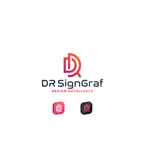
The given logo represents the Initial Logo. It is designed in a unique way to express specific things about the brand. This presents the efforts of an organization in a beautiful way, which would attract a large audience with its artistic creativity. It states an impressive-feeling and has a glimpse of professionalism that gives a background to any organization.
The given logo represents the uniquely designed initial D and R, showing the excellence in design. It is designed sharply that give an artistic feel. It is compatible with the brands and brings reputation, soothing and beautiful feeling.
The design highlights the confidence of the industry, reliability, and responsibility. It relates to trust, honesty, and dependability, therefore helping to build customer loyalty with the product or brand.
It signifies the one-to-one communication of the industry with its customers. It shows wisdom and higher ideals of the industry and is also conservative and predictable.
A help desk helps to bring satisfaction for its customers, from its services and is actively responsive, consistently assists users, and goes the extra mile in delivering technical support. This provides support to the customers and facilitates the growth of its business by increasing the number of customers. These work with the client to develop and implement the vision. It also offers recommendations and options based on the needs of the clients. It also completes requested tasks by the client and makes suggestions on opportunities or changes needed within the organization.
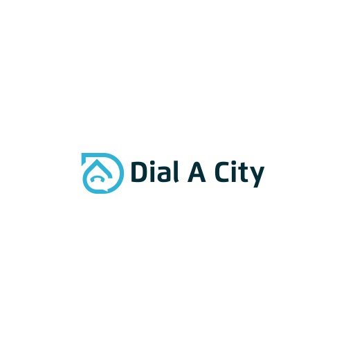
The given Logo is the Combination Mark Logo. It states an impressive feeling. It has a memorable and long-lasting impact on the mind of a person. These are compatible with the brands that want to show themselves as reputable and traditional.
It shows initial D and C with the phone icon and chatbox in negative space. It plays a significant role in designing and acts as an important part in the designing space.
It holds the design together, and also aligns the object of the design, and brings it into focus. It tends to provide the customers with a proper solution and help them to solve all their queries.
The use of Blue color in the given logo shows its attribute to evoke peace and happiness, and also highlights the enthusiasm and enlightenment of the company or brand to bring solutions with passion and stability.
In practical terms, it highlights the silver lining of a cloud that removes the crestfallen nature. The design is associated with warmth, sunshine, and positivity.
E-commerce is a huge part of the economy and plays a vital role in businesses that sell their products or services online. E-commerce gives businesses the enthusiasm that helps to bring the ability to reach more customers. With so many people making their purchases online, it proves to be the fastest-growing retail market.
It is the Iconic Logo that speaks about versatility. It allows easy rebranding. As the company or product name will be associated with the image; so the customers will get a direct point of view about the brand. It is quite clear to the audience which does not require any guessing.
It has great benefits as it gives a professional and high standard look and makes effective designs in it to highlight the brand of the organization.
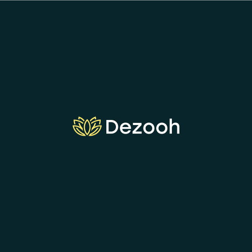
It represents the Lotus and blossom. It is purity, enlightenment, self-regeneration, and prosperity. It shows the power, legitimacy, victory, triumph, honor, and glory of the industry that satisfies the needs of its customers by delivering high quality.
The luxury color highlights illumination, love, compassion, courage, passion, magic, and wisdom of the industry with its customers that helps in an escalation of the prosperity of the industry in hundredfold.
The Healthcare industry brings positivity to the lives of the patients. Healthcare has become a trend because of the change in technology and our lifestyle, which has led to changes in the healthcare system and increased lifespan. The future of healthcare is brighter and has a positive impact on the lives of the people.
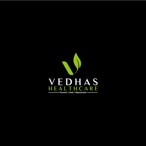
The given logo is the type of Initial logo with a uniquely designed initial V with leaf. This signifies the step taken by the industry to provide a better healthful service to its customers in a professional manner, that brings enlightenment.
It symbolizes the eternity of the industry to get the customers associated with prosperity. It also shows increasing strength, performing specific movements, and designs that help to build strength and endurance.
The Green color highlight the cheerful efforts of the industry. The Green leaf symbolizes the spread of greenery. The industry grabs the attention of the people with the help of these inspiring colors because the colors speak their language.
It evokes calm emotional responses, which are conducive to establishing the trust needed to start just such an ongoing professional and personal relationship. It signifies greenery and is vital for good health and growth. It depicts hope, renewal, and revival of the industry at times of misfortunes. It also represents nourishments, good spirit, and hope.
The arts are certainly an important part of a strong economy that brings creativity to the life and nature. In addition to amplifying the success of innovative industries, creativity in making arts takes the industry to a region a more attractive place to live for people and families working in any industry.
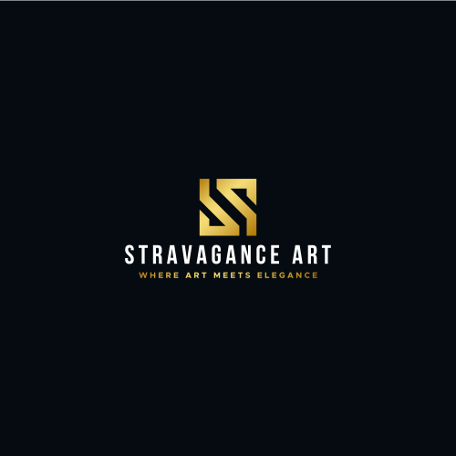
It is the Initial Luxury Logo that includes a combination of sharp designs. It speaks about versatility and allows easy rebranding. The logo of a company acts as its face or identity.
It holds the power to replace the name of the company with modification and provide it with a beautiful design. It associates the name of the industry with the creativity and arts; so the customers will get a direct point of view about the brand. It is attractive and easy to remember.
The color sparks bright responses and energetic feelings. It evokes happy feelings and energizing feelings for clients in the business. This color is most relevant to the industry and its customers. The design helps a business to stand out from others by highlighting its nature that helps pull the customers on the path of satisfaction.
It is the one that appealingly welcomes the customers. Here is how the design is usually used in the design- in the foreground to highlight essential elements, as the main color in the background to reflect feelings.
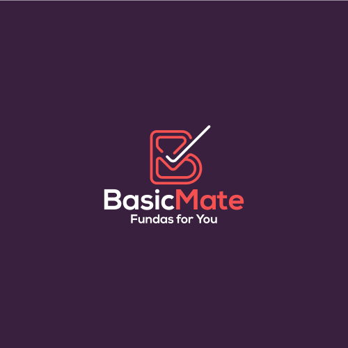
The basic learning course packages bring awareness among the masses, open avenues for opportunities as well as self-advancement and improvement. It makes learning simpler, easier, and more effective, and people can learn at their own comfort and requirement.
It is the Combination Mark Logo, with B and M letters Initials that tell a story about the organization that creates a memorable visual of the brand. It signifies growth and offers wider flexibility for branding, and perfectness for new businesses.
It shows the right tick mark that represents the completed task, an all is a good symbol, a positive reinforcement, or an indication of passing a test.
It signifies confidence of mind or manner, easy freedom from self-doubt or uncertainty spoke with assurance about the plans, and excessive self-confidence as well. It also shows the trustworthy nature of the business that brings more customers.
The design highlights the independence, creativity, mastery, and magic as well as spirituality, royalty, and wealthful nature of its business. The colors show optimism and professionalism, also idolize the humble, kind ad strong bond of the customers with the industry. It highlights the social network associated with different business perspectives. It is generally used by industry to bring passion and energy to the business giving the devotion to work.
Finance sector is considered the primary driver of the economy. It provides the free flow of capital in the market. It helps with the growth of small and medium-sized enterprises by providing them with access to finance.
When the sector is strong, the economy grows, and companies in this industry are better able to manage risk at the time of misfortunes.
The given type is the Iconic Logo, which represents the uniquely shaped Lotus, associated with the growth arrow and candlestick, that shows growth in the financial sector.
It also shows the result of excellent coordination between the industry and customers.
The design grabs attention, and it highlights the enthusiasm and enlightenment of the company or brand that brings the passion with stability. It shows the optimistic way that brings success and prosperity in hundredfold.
It is associated with warmth and positivity. It is usually aligned with marketing products on a priority basis.
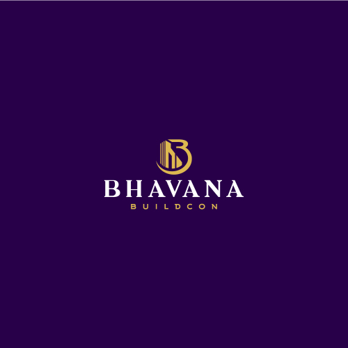
Construction marks an important sector that contributes greatly to the economic growth of a nation. The company was formed with a primary focus to provide a mechanized and robust solution in civil, electrical, mechanical, and IT-related works for strategic projects and technically challenging solutions. It believes in executing several jobs with tight timelines and budgets.
It also believes in putting together a team of technically competent and motivated front-line associates to deliver speedy and industry-best results.
It is the type of Initial Logo that represents initial B with buildings in an elegant way. It represents the industry in a most innovative manner, that embraces the new technologies.
It shows managing all the work finely and skillfully that brings development and prosperity in hundredfold, that represents innovation and efficiency to the industry, improving some of the most important stages of projects and construction.
The use of color highlights the royalty, loyalty, courage, and magic to the nature of the industry. It helps to move towards harmony with success. It also represents the warmth and emotions of the customers that associate themselves with the services provided.
It marks the perfectness in the services that satisfy the needs of its customers and satisfy them.
Submit Design
Height and Width should be the same (e.g. 1000 x 1000)
Supported file formats : .JPG / .JEPG / .PNG

Submitting...
Submit Design