Notifications
Logout
Are you sure want to logout?
Yes
No
Notifications


Full Name
Enter full name
Contact Number
Enter contact number
Enter valid contact number
Email Address
Enter email address
Enter valid email address

30 Jan 2023
30 Jan 2023
Pet-related services are important as it provides a way for pet owners to take care of their animal companions and ensure their well-being.
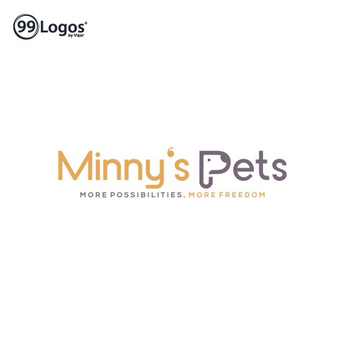
Minnys Pets shows the Wordmark Logo. It represents the P of Pets designed uniquely with the face of a Pet Dog.
It is elegantly designed to highlight the pet-related services provided by the company.
Is it a simple, clear, easy to recognize, and memorable logo, which represents the pet services industry.
It is associated with the Yellow and Old Lavender colors which help it stand out from the competition.
The logo is designed with a unique font style that can appeal the pet owners and grab their attention towards it.
It reflects the love, compassion, and care associated with the business nature.
The logo is creatively designed which makes it stand out from the crowd.
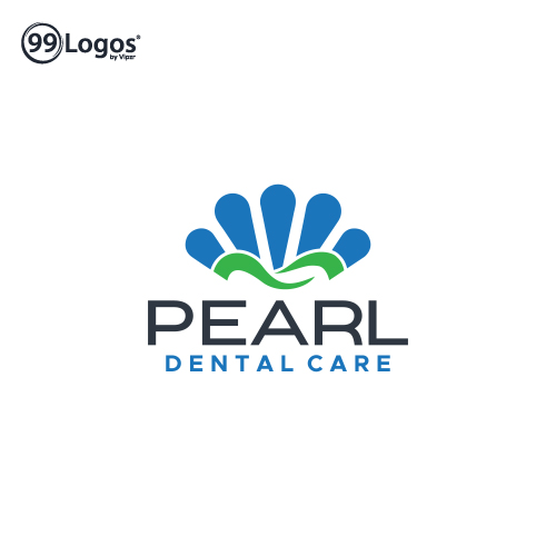
It is the Iconic Logo. It shows the uniquely designed logo with the Pearl with dental that represents the business nature. It is designed in a classy manner that grabs the attention of the people. The design highlights professionalism and wisdom associated with the business nature. It is a creative and memorable representation of a dental practice or a dental product brand. It creates a recognizable image that can symbolize the idea of a pearl of wisdom or the value and importance of dental care.
The iconic logo featuring a pearl is the perfect representation of dental care services. The round, smooth and lustrous shape of the pearl symbolizes the importance of oral hygiene and healthy teeth. The design showcases the pearl in a simple and minimalistic manner, making it easily recognizable and memorable. The pearl is a timeless and sophisticated symbol, making it an ideal choice for a dental care brand that values elegance and quality.
This iconic logo with a pearl is a powerful representation of a brand dedicated to providing exceptional dental care services. Its clean and refined design emphasizes the commitment to promoting oral health and creating beautiful smiles.
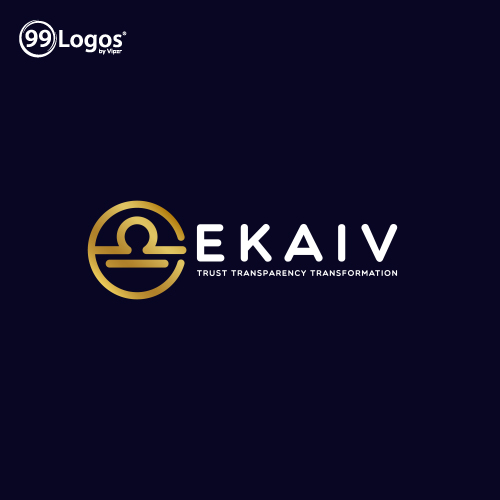
It is the type of Abstract Iconic Logo. It shows the clean and exceptionally designed logo with the Libra zodiac sign in an abstract manner with perfection.
The given design is a creative and memorable representation of a brand associated with balance, harmony, and fairness.
The abstract iconic logo featuring the Libra zodiac sign is the perfect representation of balance and harmony for real estate and brokerage services.
The unique and modern design of the Libra symbol embodies the idea of finding the right balance between buyers and sellers in the real estate market.
The abstract nature of the logo gives it a sophisticated and timeless feel, making it an ideal choice for a real estate brand that values innovation and elegance.
It has a memorable and long-lasting impact on the mind of a person. It is a simple and modern design that creates a clean and professional look and signifies a sense of expertise and professionalism.
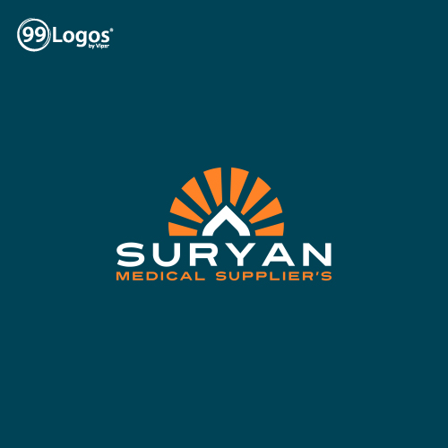
The given logo is the Iconic Logo. It shows Sun rays associated with a growth arrow in a creative manner.
It represents energy, vitality, and positivity that highlight taking steps in achieving progress and bringing growth to the business.
It is represented in a bold and dynamic manner that creates a sense of forward movement and expansion.
It shows the initiative to move in an upward direction and bring innovation.
Its bright and energetic essence keeps it apart in a competitive market and conveys a message of optimism and positivity. It conveys the company always moving forward and reaching new heights of success.
The design color highlights the illumination, optimism, positivity, passion, and wisdom which help in an escalation of the prosperity of the industry in hundredfold.
It also shows the attribute to work with enthusiasm and bring solutions with passion and stability.
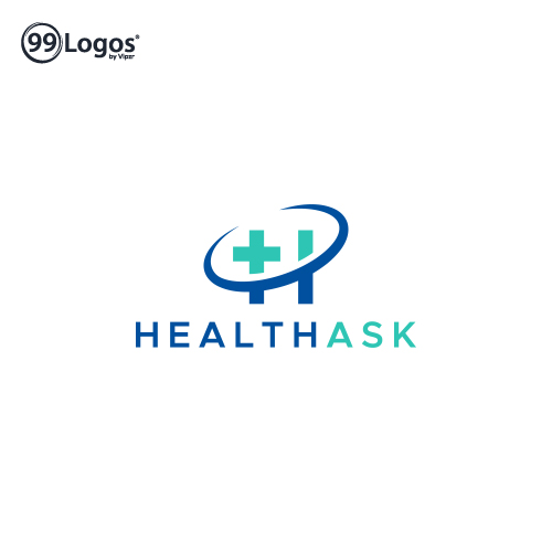
HealthAsk is the type of Combination Mark Logo. It shows the exceptionally designed logo associated where the initial H is associated with the + sign in a clean and elegant manner.
It is a clean and recognizable representation of a healthcare organization or a health and wellness brand. It creates a strong and recognizable image and can work well for a healthcare organization. It conveys a sense of humanity, inclusivity, professionalism, and expertise.
It evokes the feeling of trust, care, and comfort with its clean and elegant look. It is an effective symbol of care and compassion which is designed in a professional manner.
It gives a clear idea to the people about health-related services and would enable people to get health-related tests and get their issues resolved. It indicates the services offered to the people builds up in an engaging manner.
It is easily recognizable and memorable so that patients and customers can easily identify and associate it with the healthcare services offered. It communicates the commitment of the services to provide high-quality, compassionate care to its patients and clients.
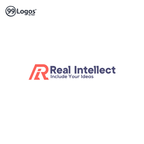
Real Intellect is the Initial Logo. It shows the Initial R of Real associated with the lowercase i of Intellect in a clean and elegant manner.
It is a strong representation of real and intellect, making it the perfect choice for a renting and leasing services brand.
The combination of the initial R, symbolizing real estate, and the initial I, representing intellect, embodies the idea of a company that offers smart and practical solutions for renters and leasers.
It represents the brand focus on providing reliable and innovative rental and lease services.
It signifies the commitment of the company to providing real-world solutions, connection to the digital field, and focus on intellect.
The design shows a modern style that makes the logo legible and memorable.
It highlights the sense of unity and continuity and emphasizes the commitment of the company to deliver a seamless and integrated experience for the clients.
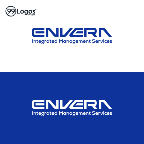
Envera shows the Wordmark Logo. It shows a clean and elegant logo that conveys a sense of efficiency, professionalism, and integration.
It is easy to read and highlights a sense of stability and reliability.
It conveys the commitment of the business that delivers comprehensive and streamlined management services.
It signifies confidence of mind or manner, easy freedom from self-doubt or uncertainty spoke with assurance about the plans, and excessive self-confidence as well.
It also shows the trustworthy nature of the business that brings more customers.
The design shows optimism and professionalism, and also idolizes the humble, kind ad strong bond of the customers with the industry.
The logo is creatively designed which makes it stand out from the crowd.
The logo is designed with a unique font style that can appeal the people and grab their attention towards it.
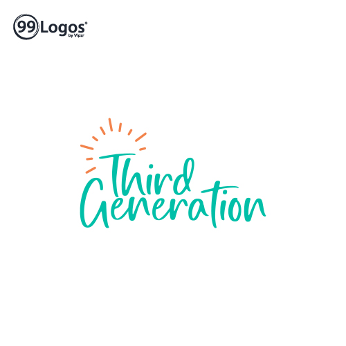
Third Generation shows the Wordmark Logo. It represents an elegantly and creatively designed logo with a unique font.
It conveys a sense of joy and excitement of a delicious meal or refreshing drink, which brings comfort and enjoyment to the life of people.
The design delivers the commitment of the company that delivers enjoyable and satisfying food and drink experiences to its customers.
It signifies the brand identity of the company, organization, or product through the use of typography.
It conveys the personality, values, and attributes of the brand, and is an effective way to establish brand recognition.
The logo is designed in a way that evokes the feeling of warmth, nourishment, and enjoyment.
The design indicates the positivity aligned with the business aspects that focuses on high-quality and freshness associated with the food and drinks provided by the company.
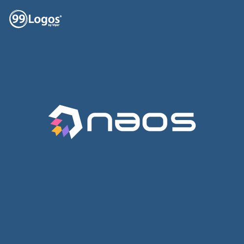
Naos shows the Iconic Logo. It shows three arrows associated with Red color, Yellow color, and Purple color.
It is further connected with a forward arrow in a negative space in a clean and elegant manner, which represents a sense of forward momentum, growth, and dynamic change.
The three arrows, each in a distinct color, can symbolize different aspects of a company, such as its products, services, or values.
The formation of a new arrow in the negative space between the three arrows can suggest the bringing together of these elements to create something new and innovative.
It symbolizes progress, innovation, and collaboration, making it an effective representation of a company that is constantly pushing boundaries and achieving new heights and growth.
The logo is creatively and appealingly designed which makes it stand out from the competition.
The logo is designed with a unique font style, and conveys a sense of positvity and professionalism.
Submit Design
Height and Width should be the same (e.g. 1000 x 1000)
Supported file formats : .JPG / .JEPG / .PNG

Submitting...
Submit Design