Notifications
Logout
Are you sure want to logout?
Yes
No
Notifications


Full Name
Enter full name
Contact Number
Enter contact number
Enter valid contact number
Email Address
Enter email address
Enter valid email address

11 Jul 2022
11 Jul 2022
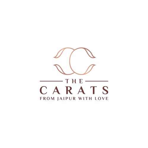
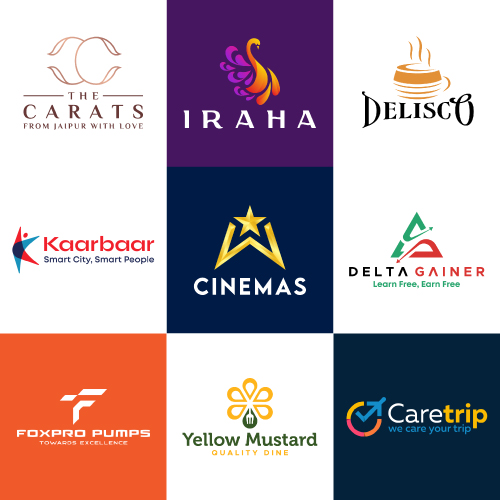
Diamond jewelry provides a high-valued and luxurious look to individuals. It is associated with rigidity, infrequency, and exceptionality which provides shows the social and economic status and success.
It reflects shining and purity and shows significance extremely. These are considered as one of the most passionate gemstones in the world. The Diamond jewelry gives an elegant and classy look to the people wearing it.
Carats is the type of Luxury Initial Logo. It represents the C-C letter which is designed in a clean and elegant manner.
The logo represents the professionalism and creativity associated with the work that traipses the interest of the customers with satisfaction.
The uniquely designed curves in the logo highlight the feminine look.
The colors associated with the logo design highlight the prestige, success, wealth, and prosperity aligned with the services.
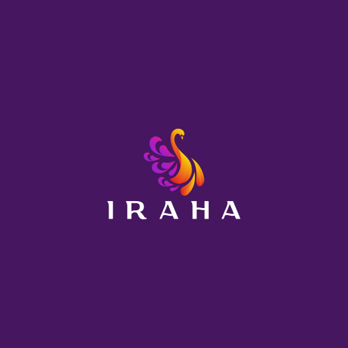
Clothing helps people to look more attractive and comfortable. People wear different types of clothes in a different styles. Clothes express the personality in an exceptional manner. The clothing business provides different kinds of clothes compatible with the choice of the people, which makes them look good.
The given logo represents the Iconic Logo. It is designed in a unique and creative way to express specific things about the brand.
This presents the significance of a clothing business in a beautiful way, which would attract a large audience with its artistic creativity.
It gives an impressive feeling and has a glimpse of elegancy that gives a background to the brand.
The given logo represents the uniquely designed Peacock, showing excellence in design. It is designed sharply that give an artistic and traditional feel. It is compatible with the brands and brings a reputation, soothing and beautiful feeling.
The colors highlight creativity, authenticity, cheerfulness, positivity, and energy associated with the services.
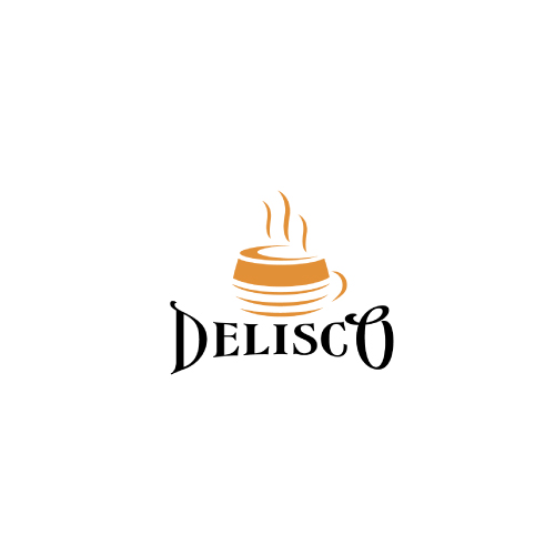
Restaurants mark its importance in offering delicious food to the customers and satisfying their needs. A smartly designed menu offered at the restaurants brings joy and place a significant impact on the customers.
The company aims to provide customers with high-quality food at restaurants. Restaurants and Hotels bring a delicious taste to the customers, which makes their mood delightful.
The given Logo is the Iconic Logo with the company name.
It has a memorable and long-lasting impact on the mind of a person.
It represents the cup designed in an exceptional manner with the smoke coming out of it.
It holds the design together, and also aligns the object of the design, and brings it into focus.
The colors in the given logo show its attribute to evoke the interest of the customers, and also highlight the warmth, energy and reliability aligned with the services.
Online services mark its importance in bringing ease to the business.
It increases sales of the business as it extends its hands and reaches new markets, which is beyond the physical reach.
It connects with a wide range of people and serves them with flawless online services.
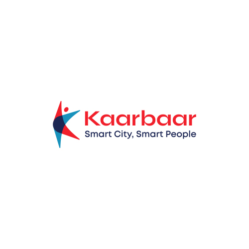
The given type is the Combination Mark Logo. It represents the uniquely designed abstract person, and an initial K, designed in an exceptional, clean, and elegant manner.
The logo is designed colorfully in an overlapping manner and could be remembered even after a long time.
It signifies the step taken by the company to provide proper online service and keeps the people associated with the services.
The design shows the stability and professionalism aligned with the business nature.
The colors highlight warmth, wisdom, and loyalty associated with the business, which triggers the attention of the people.

Traveling is considered as one of the best ways to enhance enthusiasm and activeness.
It enables a person to explore and visit newer things different from the daily routine.
Traveling helps us to visit a different part of the world, and makes us relaxed from all the household tensions, and gives a sense of independence, and ultimately is the best option for bringing a healthy and happy life.
The given logo is the type of Iconic logo with a uniquely designed C associated with the right tick mark and Airplane.
It is a long-time memorable logo, that shows a glimpse of the business nature in the logo.
This signifies the step taken by the industry to provide a good experience with the holiday packages, that bring enlightenment.
The colors highlight the cheerful efforts of the industry.
The industry grabs the attention of the people with the help of these inspiring colors.
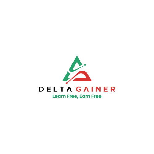
The stock market marks its importance in attracting millions of traders from across the world. These offer ample opportunities for the traders to trade with ease. It is associated with risk as well as great profit margins.
It is the type of Iconic Logo that includes an exceptionally designed Delta.
It is designed in a unique, clean, and sharp manner.
It shows two arrows designed in an elegant manner, where one arrow goes upward and the other one goes downward, which signifies the profit and loss in the stock market. It is attractive and easy to remember.
The color sparks bright responses and energetic feelings.
It evokes happy feelings and energizing feelings for clients in the business.
This color is most relevant to the industry and its customers.
The Green and Red color and Red color highlight harmony, passion, and excitement aligned with the business and services.
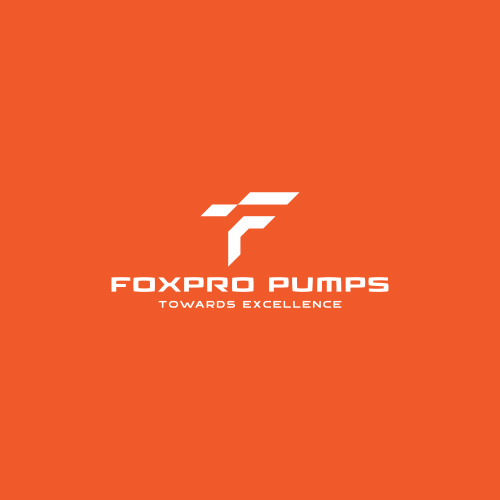
A dosing pump is a positive displacement pump, which is designed to inject a chemical or another substance into a flow of water, gas, or steam.
These dosing pumps are typically small, which marks its importance to provide an extremely precise flow rate for maximum control.
It is the type of Initial Based Logo. It represents the initial F designed in a unique, clean, and elegant manner. The logo shows a glimpse of an industrial feel.
It signifies the step taken to manufacture and provide dosing pumps.
It is generally used by industry to bring passion and energy to the business giving the devotion to work.
The design shows optimism and professionalism. It also highlights the efforts taken to manufacture dosing pumps.
The colors highlight warmth, purity, clarity, and prosperity associated with the services.
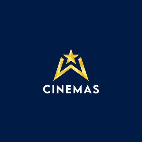
The entertainment industry mainly includes a broad range of companies involved in businesses such as telecommunications services, television, music, video games, and live concerts.
These take steps to entertain the people and keep them associated with its services.
The given logo is the type of Combination Mark Logo.
It represents the initial W-W designed in a unique manner, where one W is in a negative space with a star.
It signifies the company takes steps to provide proper entertainment services to the people.
The design grabs attention, and it highlights the enthusiasm and enlightenment of the company or brand that brings passion with stability
It shows the optimistic way that brings success and prosperity in hundredfold.
The colors highlight happiness, hope cheerfulness, and positivity linked with the services.
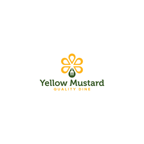
Restaurants mark its importance in offering delicious food to the customers and satisfying their needs. A smartly designed menu offered at the restaurants brings joy and place a significant impact on the customers. The company aims to provide customers with high-quality food at restaurants. Restaurants and Hotels bring a delicious taste to the customers, which makes their mood delightful.
The given type is the Iconic Logo. The design represents the Mustard flower designed in an exceptional, and elegant manner with a fork associated with one of the petals.
This shows the main focus of the company in providing proper services, which signifies the strong connectivity with progress, trust, and protection included in the industry.
The colors highlight the harmony, happiness, hope, cheerfulness, and positivity aligned with the business and services. It helps to move towards harmony with success.
It also represents the warmth and emotions of the customers that associate themselves with the services provided. It marks the perfectness in the services that satisfy the needs of its customers.
Submit Design
Height and Width should be the same (e.g. 1000 x 1000)
Supported file formats : .JPG / .JEPG / .PNG

Submitting...
Submit Design