Logout
Are you sure want to logout?
Yes
No

Full Name
Enter full name
Contact Number
Enter contact number
Enter valid contact number
Email Address
Enter email address
Enter valid email address
10 Feb 2022
10 Feb 2022
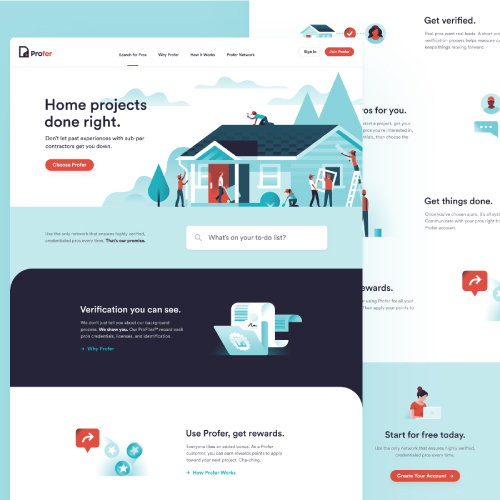
A website layout can be considered as the pattern or framework which shows the structure of it. It marks its attribute in structuring the information present on a site, both for the website owner and for users.
It highlights the clear paths for the visitors for navigation within the web pages, and also to find and put the most important elements of a website front and center.
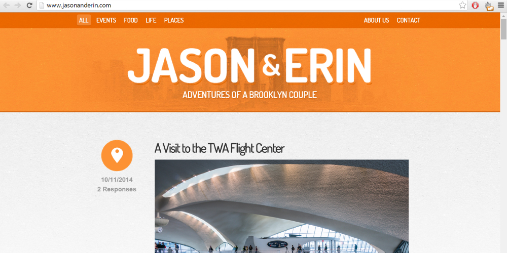
The main content of any website is considered as the core information, that attracts the attention of the viewers appealingly. Single column layout marks their importance in presenting the main content in a single, and vertical column.
It is designed in the simplest form and helps the visitors to navigate easily, where the viewers can find the necessary content they need and stay on the page for more time. Their appealing attribute makes them attractive and popular.
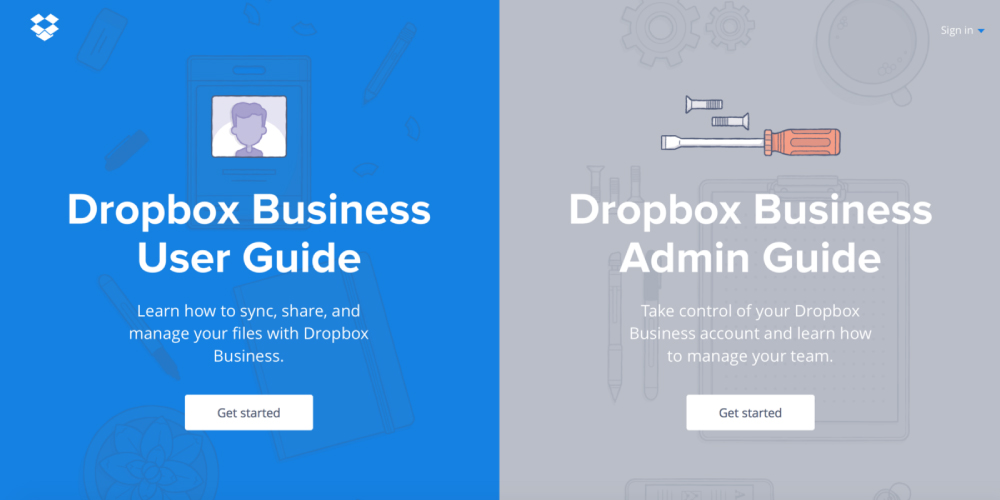
As the name indicates, the split-screen is the type that divides the web page into two main pieces of content. Both the parts get equal importance on the website.
These split screens get displayed on the website simultaneously and get considered equally. This marks their importance in being perfect when the site offers two variations that are different.
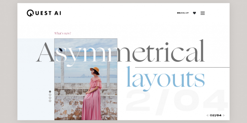
These types mark their importance in engaging the viewers with the site by changing the width, scale, and color. When the designers wish to create something interesting and unbelievable content, ultimately providing directional emphasis.
Asymmetry indicates the absence of similarity between two sides of the layout, which is presented in a different style. It is a long-time favorite technique as compared to the other types, which attracts the attention of maximum visitors to the creative layouts.
This kind of layout aims to create a balanced structure that shows the symmetry and proper similarity in between the two parts and ultimately focuses on the attention of the visitor.
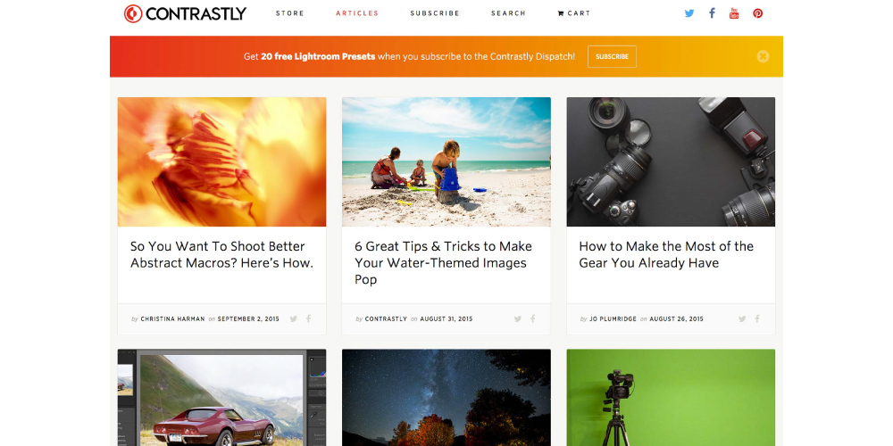
These marks their importance in getting the clickable information, and easily get the present information in an informative manner.
The grids are known in marking their attribute that brings proper order and clarity to the designs, which will highlight an improved overall look and feel. They also organize the distribution of content and media across the structure of the design platform.
The visitors could find it easily by clicking and tapping on the information on the card. These can get manipulated as they vary in size, space, and number of columns and styles.
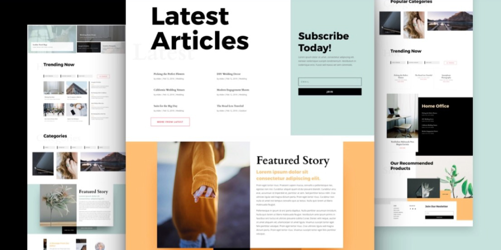
People prefer reading magazines at their leisure. Some people spent maximum time reading magazines which provide multiple chances to attract the attention of the audience. It helps to reach the target customers in the market easily and quickly.
Whenever the company needs to advertise the brand in a colorful, bright, and appealing manner, then there comes the need for glossy advertisements in magazines. These are quite more expensive than newspapers but are the most effective method in terms of marketing.
Similarly, digital magazines too use a multicolumn grid which integrates the text and illustrations to form a proper layout. This helps the visitors to scan, read, and understand a page quickly and conveniently They present the visual information properly using a modular grid that offers flexibility. It prioritizes the information present on the site and tries to make it easy to scan the sections on the page.
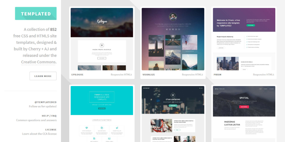
These are customized in several ways. From thickness and size to coatings, adhesives, graphics, and shapes, and help the businesses to suit their brand. This layout shows the larger header width box, associated with a few smaller boxes.
These small two to five boxes take up a portion of the larger screen of the box. Each of the boxes consists of the links on the site, which allows a larger and more complex page. It shows the versatility layout, which works with the portfolio sites and also the e-commerce websites.
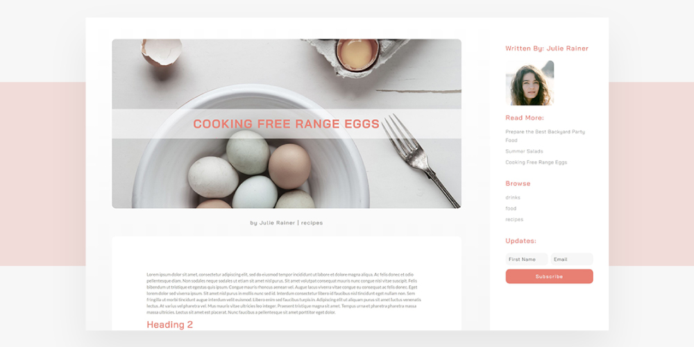
As we know that navigation is a critical part of any site, and the main menu is found firstly to most of the users when they navigate to find the useful content they need on the site.
Along with top-side horizontal navigation, it’s possible to keep menu options in sight by placing them in a fixed sidebar. The sidebar is a vertical column on the left or right part of the page. For this web layout, the sidebar stays stationary and always remains visible while the rest of the page changes as users scroll the page down. This way navigation remains accessible.
When the websites appear properly, then it is viewed as the most trustworthy and credible. It becomes reliable in the minds of the people. The pages in the second place are not viewed the most, but the topmost site is probably referred to as the most informative and trustworthy.
Whenever any company gets its site designed properly with fixed sidebars, then becomes a credible and trustworthy source, which ultimately becomes a brand later. When the customers notice that the brand is consistently getting views and lies in the top search, it leads to brand awareness. It also improves branding by building with a better user experience.
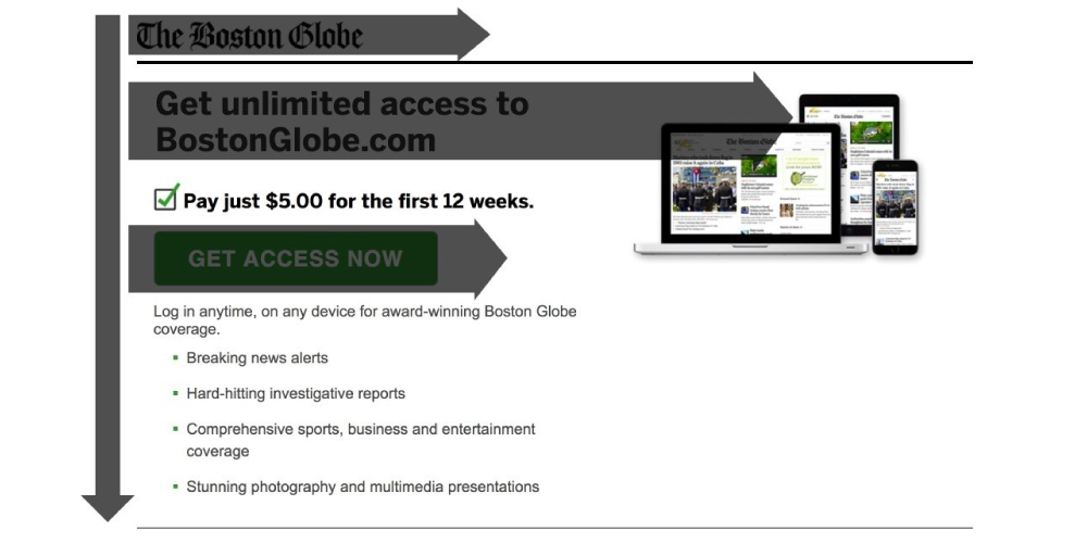
F-shape layout type of website was created on the basis of the experience of the users who read content on the web.
This pattern is created by a scanning pattern, that originally states that the users typically scan the heavy blocks in the F or E pattern.
This pattern is applied to the content area of the site, which highlights the better experience of the people after they visit the page.
Many people usually do not get a clear picture in their mind about the services offered, so the website needs to take the help of the images to attract the attention of the customers. So the engagement of images helps to drive the message properly to the minds of the people.
Nobody will get interested in reading a context that is difficult to read or contains less quality. If the people would find our content appealing, then they would leave our page. When there are additional keywords, then there is an improvement in visibility at the site.
This site layout can be beneficial when the employees think to decide what visuals to show the visitors at the site. Here comes the use of curated visuals, which are authentic illustrations that mark their attribute in being unique to the specific company which easily connect with maximum customers. Curated visuals also showcase the message or emotions, the company wants the customer to feel when interacting with their products or services.
Many people usually do not get a clear picture in their mind about the services offered, so the website needs to take the help of the images to attract the attention of the customers.
Proper alignment of design layout helps to drive the message properly to the minds of the people. Nobody will get interested in reading a context that is difficult to read or contains less quality.
If the people would find our content appealing, then they would leave our page. When there are additional keywords, then there is an improvement in visibility at the site.
The use of images makes the content of the site easy to remember even after a long time. It helps to provide visual content appealingly for the customers. A website not only gives credibility but also brings a positive impression that the company always looks for.
A responsively created website layout brings to a better user experience. It will attract maximum visitors and allow them to gain a better user experience at the website.
They will experience proper navigation which will keep them staying for more time on the site. It scales the website properly and properly aligns the screen size, so that the viewers do not get issues, and could easily access the menus, links, buttons, or filling out the forms.
When the industry receives traffic from its efforts on these types of search terms, then there come more viewers to the site. Website is one of the most cost-effective platforms of digital marketing. It engages the services with Google and helps to promote any product as well.
Its analytic thing collects data to improve the organic traffic. As and when the ranking starts getting progress, then the industry receives prosperity every day, every week, and every month. These metrics show more about the visitors. It provides great information and interest and helps in the decision-making.
If a company makes its website, then it has to make it easy to access for its customers. So when any company provides fast loading pages, then that it is easily accessible for its customers. This would also help to get a fast speed.
It offers the users search tools for quick and proper navigation. The users get a good platform to search and get the required content they want. It proves to be a good platform for the customers, as well as for the company that directly provides proper information about the industry and product. The website designer not only develops the web page but also tests the pages regularly for ease of navigation.
The design layout when presented with proper useful content forms a good customer base. This helps in obtaining belief in the minds of the customers. When the website achieves credibility and trust in the minds of customers, then it brings more customers.
When any of the sites is available on Worldwide Web then the company gets highlighted on a global platform. This means that the small enterprise situated at any location could be searched and provide products to a wide range of customers. It also saves the customers from the traveling cost. It offers a convenient way for buyers and sellers.
SEO is considered a fundamental aspect of any website because it helps it to raise its rank on Google. There is a lot of competition in the digital world, so it becomes very difficult for it to get a top rank. It needs to follow all the required guidelines provided by the Search Engine Optimization tool, to get well-known for many people. The improvement in technical SEO, developing new content, and building quality backlinks help in bringing more visibility to it.
When the designer brings design to the site, they have to look for the proper title tags, good keywords stuffing, as well as higher ranking. It conceptualizes in the form that it meets up all the standards to get a high rank. As and when any website succeeds in the proper making of the SEO, then it becomes user friendly by acquiring a top position. There is a requirement for simplistic designs on the pages, which brings more views on the page.
[The images are being taken from the registered companies and belong to their respective owners only.]

Submit Design
Height and Width should be the same (e.g. 1000 x 1000)
Supported file formats : .JPG / .JEPG / .PNG